Task 1: Impression test
“What’s with all the extra stuff?”
We started off each test by having users explore the home page of the site they were testing for just 15 seconds, then asking what they remembered and how they felt about the page.
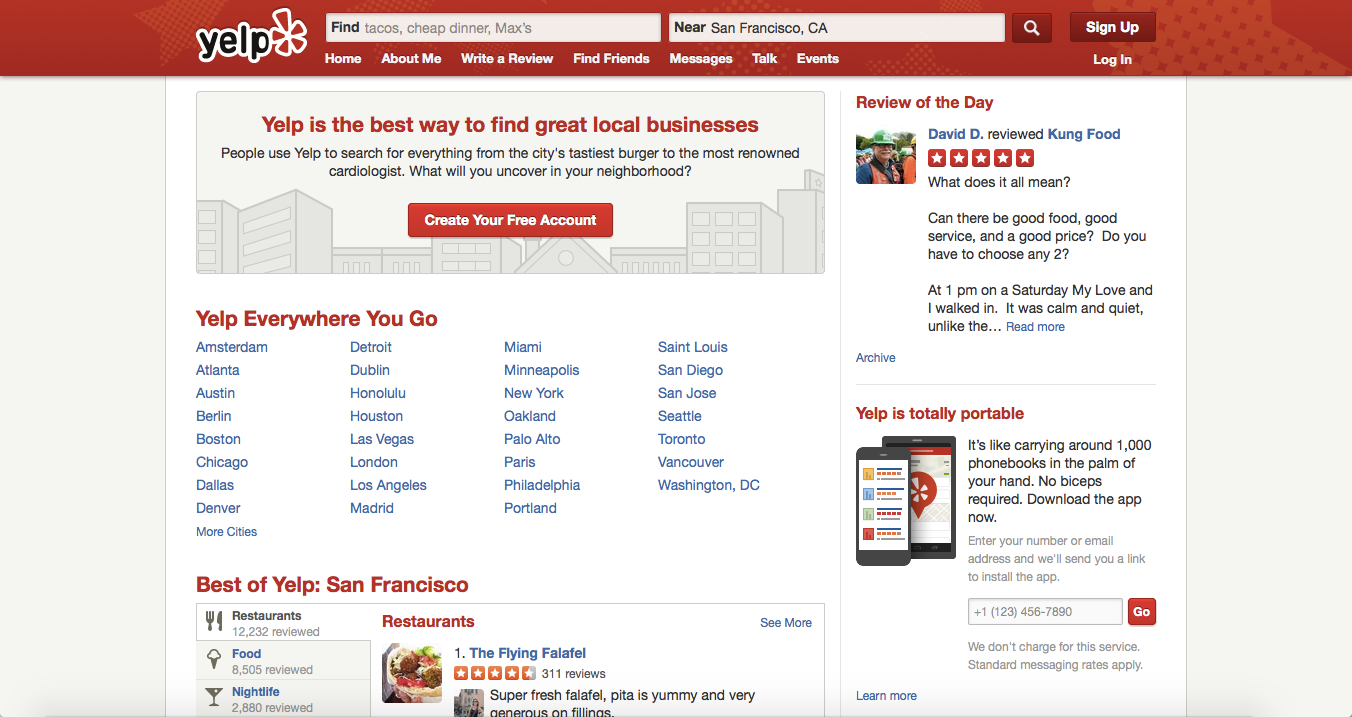
All of our Yelp testers were familiar with the platform, and accurately described it as a tool for researching local businesses and reading reviews. A majority also characterized Yelp’s home page as “cluttered” or “busy,” saying it was loaded with information that was mostly unuseful and uninteresting to them.

In the words of one tester, the bright red top bar, with its “attractive logo” and search bar, is where all the action happens; “my eye is kind of ignoring the rest of it, because I know I’m going to be using the search bar.” Others echoed his sentiment that most of the front page content, especially things like Review of the Day and Recent Activity, did little to contribute to their goals on the site.
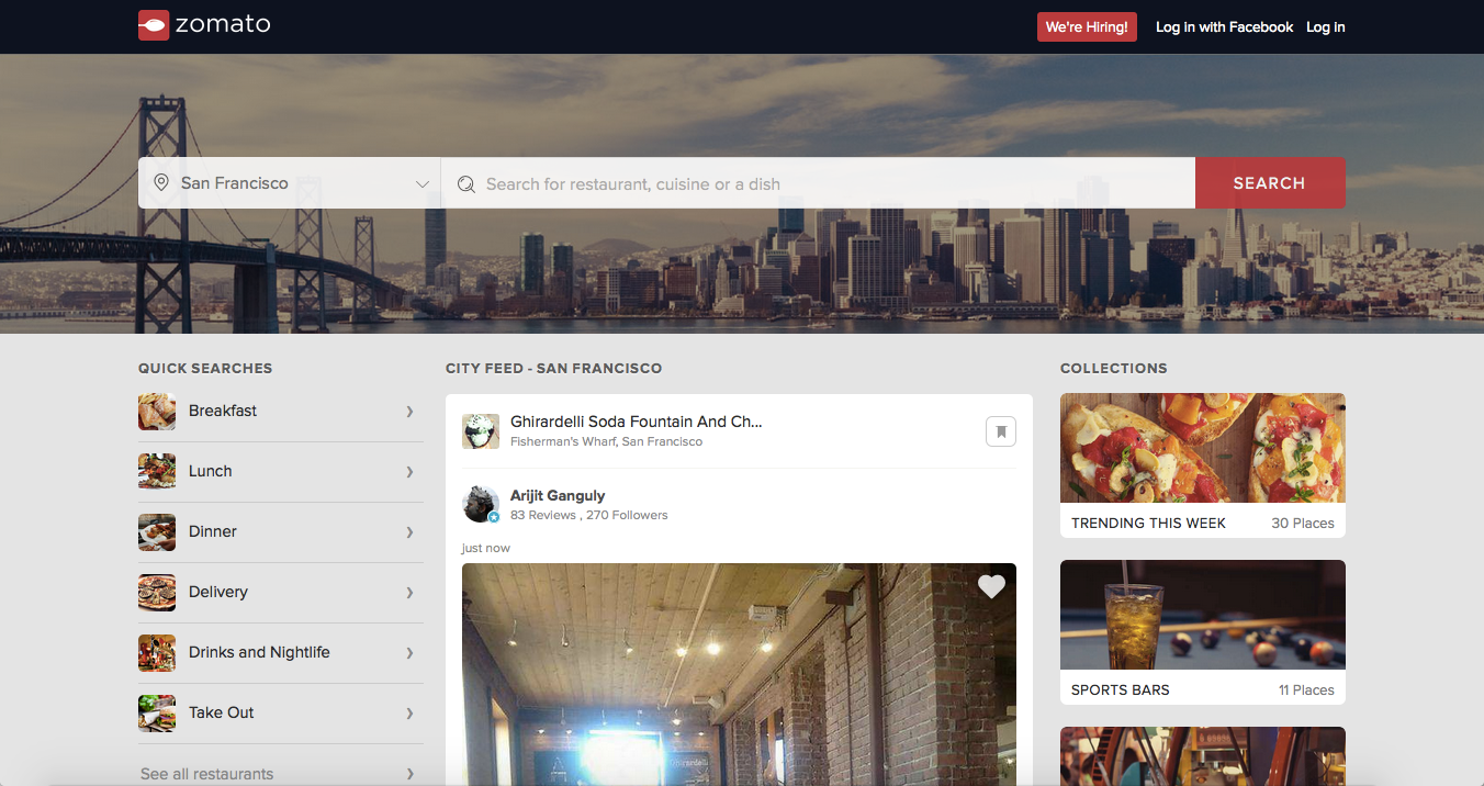
Testers for Zomato quickly gathered what the site was for, recalling words like “restaurant,” “food,” and “reviews.” Many complimented the “clean, modern design” with its heavy focus on pictures and its “attention to detail,” and expressed interest in front page offerings like Quick Searches and Collections.

The site is clearly aimed specifically at food and food-lovers, one user commented, and – noting its integration with social media and food blogs from around the web – called it almost like a “Facebook for foodies.”
For its streamlined visuals, conceptual clarity, and a careful focus on providing useful and relevant links on every content segment of the landing page, Zomato takes the lead over Yelp for this round.
Task 2: Find a place to eat
Filter falters
As users moved on to look for restaurants, the two sites displayed several strengths: while each chooses a different logic for top bar actions like choosing a location and making a search query, both proved intuitive and easy. Both sites also provide powerful and useful auto-suggestions, and the results sections on each site are well-organized and easy to comprehend.
Zomato is the first to raise a minor usability issue: when users click into the search bar, the site’s header slides offscreen to bring the main banner, and the search bars residing in it, all the way to the top. While clearly intended to help users, this interaction ends up being more jarring than pleasing. “I don’t like being jerked around,” said Raj from New Jersey.
After making their search, most users next sought to filter their results to find a restaurant that fit their preferred specifications.

Yelp made the decision to fit its filters section horizontally along the top of the results page, with some negative consequences for usability. Due to the lack of space for long vertical lists, each filter category (neighborhood, food type, etc.) only displays the first four options, with the rest accessible only via popup, significantly slowing the process and obscuring many options from users. Albert from Kansas City even suggested that “filter options can be displayed on the left hand side to make things easier.”
 This is precisely what Zomato did for its filter section. Each category is listed vertically along the side, where there is more room to list out a variety of options for each.
For most categories the options are still hidden by default (even in this format, showing everything would take too much room) but Zomato uses an expandable list format that’s much less interruptive than Yelp’s popups.
The two sites treat multi-selections differently as well. Zomato uses checkboxes for its More Filters category, allowing people to filter for parameters like “Alcohol served” and “Live music” at the same time (results will only show restaurants meeting both criteria). But for categories like Price Range or Cuisine, only one option can be selected at once.
This means it’s impossible to see restaurants in the “$” and “$$” categories together, for example, or restaurants serving both Mexican food and burgers. While this is internally consistent with how Zomato handles multi-selection, these are still search options some users want.
Yelp, on the other hand, allows multi-selection for every category. This is achieved with different multi-selection paradigms for different categories: filters for features like alcohol, music, and seating are subtractive, so that restaurants not fitting any one of the criteria are removed from the results, while filters for cuisines and price ranges are additive – checking Mexican and Burgers will show all restaurants matching either one.
Lastly, the sites contrast in their use of color to indicate ratings. Yelp sticks with its red-everything color scheme, somewhat uncomfortably making the best ratings red and lower ones orange and yellow. Not only does this not follow typical color associations, it makes the ratings stand out less within the site’s visual language.

Zomato‘s more traditional red-is-bad, yellow-is-ok, green-is-good scale is instantly recognizable, packs much more nuance, and makes it a lot easier to scan the results quickly for the best restaurants.
For allowing a greater range of search options and combinations, Yelp takes this round, but Zomato’s smoother and smarter displays make it a very narrow win.
Task 3: Check the hours, price range, and reviews for a restaurant
Form and function
Both Yelp and Zomato make this information plainly available on the restaurant pages, and both position the information in the exact places that users expect to find it within each site’s respective design scheme.
Zomato has a cleaner, more modern design that contrasts with Yelp’s busier, somewhat clunky aesthetic, but in this case the visuals don’t really help Zomato: Yelp makes much more economical use of their space to pack the most important information in where it can be seen immediately – even if it’s not quite as pretty.
Rating, price range, hours, cuisine type, photos, and review excerpts are all visible above the fold on Yelp’s restaurant pages, whereas Zomato‘s entries have lots of wasted space and shove everything but the rating, menu, and map down off the screen. One user commented it was odd how far they had to scroll to see any reviews on Zomato.
Moreover, Zomato still feels as if its not yet complete – many restaurants are missing one or more bits of information like hours or price range, and there are far fewer reviews. One way Zomato does stand out here is with its inclusion of blog posts about the restaurant from around the web, which increases credibility and provides more thorough and reliable information than random reviews.
While it’s probably true that Zomato, a relative newcomer to the US market, is indeed incomplete for some American cities, an understandable problem is not the same as an excusable one. Whatever the reason, Zomato visitors are left wanting in many cases, and that’s bad for the user experience. Add to that Zomato’s unimpressive use of space on their restaurant pages, and Yelp wins this round too.
Back to basics
While Zomato clearly has a lot of catching up to do, its fundamentals are actually stronger than Yelp’s. Zomato has built a highly coherent and focused experience that puts the emphasis on being a comprehensive network for food-lovers. Very little on the site is superfluous; as Charleston’s Sunny put it, “There is nothing confusing or distracting.”
Users were impressed with the amount of “attention to detail” evident in the site’s content, and unlike on Yelp, several testers actually used Zomato‘s curated lists and suggestions to find restaurants.
Yelp works very well in a functional sense, and there is really nothing missing from the experience. The site’s biggest faults are a dated visual design that reminded one tester of the late 90s net (“Not in a bad way!”) and general clutter and unnecessary ‘fat’ that could use trimming.
As Zomato matures and fills out, its strong UX fundamentals give it a real chance to pose a threat to Yelp. Until then,
this month’s UX Wars winner is…

Read:
UX Wars February: OkCupid vs Match.com
UX Wars May: Expedia vs Priceline
UX Wars September: DraftKings vs FanDuel


