“You X …” is a recurring series on creative ideas and interesting stories to inspire great UX design. You x Art is the first in this series.
And their eyes were watching… you
What do you do when you look at a painting? How do you experience it? Do you search for something? Does the subject or the technique interest you more than the context or the artist? How long is long enough to fully, or at least adequately, appreciate the painting?
There are about as many ways to look at paintings as there are paintings to look at. But how often does a painting look back? Beyond the eyes of a portrait, have you ever felt like a painting was strangely aware of your presence?
Enter 17th century Spanish painter Diego Rodríguez de Silva y Velázquez and his 1656 masterpiece Las Meninas (or “The Ladies-in-waiting”). The oil-on-canvas work is among the most acclaimed and influential paintings in Western history, and was painted during the peak of Velázquez’s artistic career as King Philip IV’s favored painter and at the height of his status in the Spanish royal court.
Las Meninas, Diego Velázquez c.1656
Although there are literal tomes written about Las Meninas, you don’t need a degree in art history to understand why the painting is held in the regard that it is. With its enormous size (125.2” x 108.7”), Las Meninas makes getting absorbed into the elaborate scene inevitable, revealing the layers of depth at play in Velázquez’s art to anyone willing to give it a glance.
Ostensibly, Las Meninas is a snapshot style painting from the perspective of models (possibly King Philip IV and Queen Maria judging by the mirror reflection in the back, or that could be a reflection of the in-painting canvas) witnessing a scene while being painted. The viewer is simultaneously playing the role of the surrogate subject as well as the detached perceiver.
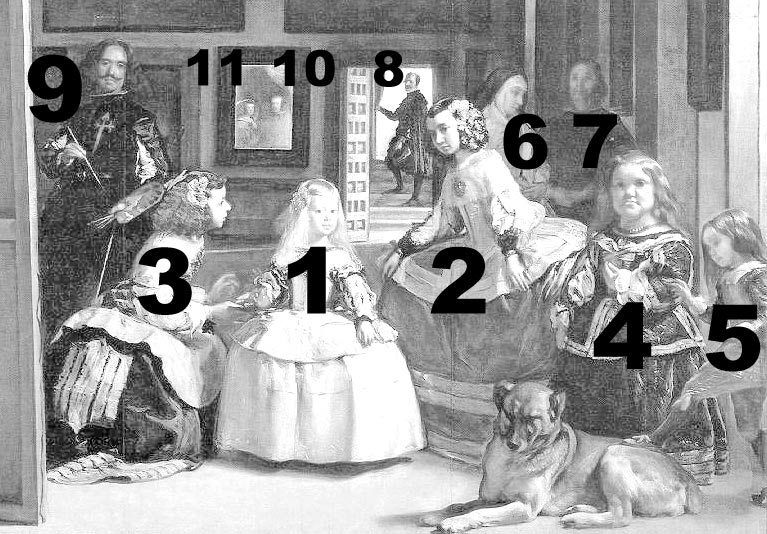 See the list here
The painter, confirmed to be Velázquez himself, as well as 4 others (including the Spanish princess) give us their attention. The identities of the 11 figures are almost entirely known, with the exception of the figure that the nun is speaking to (presumed to be a guard).
If you consider the historic context of this being a collection of royalty in the privacy of the Spanish palace, you might feel like an intruder. Perhaps it’s no wonder half the room is staring at you.
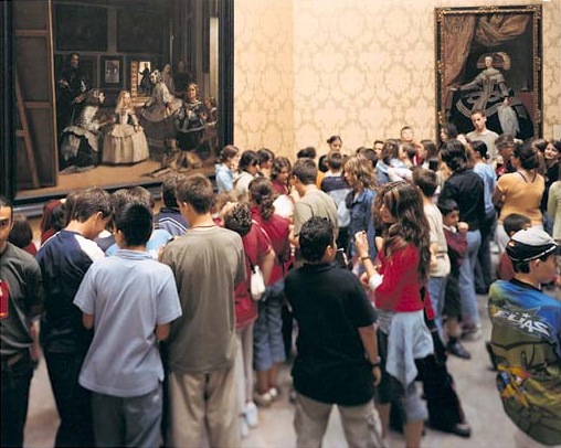
A mirror reflection of a dream world
After you get the gist of the scene and begin to reconcile what’s actually happening, the painting starts to get… weird. Is there a single focal point? If the focal point shifts, how many are there? It feels like you can just walk into the painting, doesn’t it? The light seems to be illuminating whomever it wants instead of whomever it ought to be.
 Las Meninas, reconstruction of pictorial set and visual field: plan and section (source: Luigi Cocchiarella)
If you think putting down a grid helps find the center or logical light sources, it doesn’t.
Why is the mirror out of focus? Velázquez could very easily have made it be crisp and clear, as it should’ve been in reality, and as it was in the 1434 painting The Arnolfini Wedding by Jan Van Eyck, which Velázquez certainly knew about.
The Arnolfini Wedding, Jan Van Eyck c. 1434
If you’re getting hung up on questions like that, consider that Las Meninas isn’t at all concerned with continuity within itself. You don’t have to look at Las Meninas and believe it to be reflective of any reality or to be necessarily biographical of any person, time, or place.

Reading too much into the biography of Las Meninas causes it to breakdown. Even technically, the painting bucks reality. Velázquez’s brushwork is celebrated for its lightness and ability to create ethereal shapes from distances despite the inherent patchiness of the strokes themselves.
Put another way, he creates the illusion of form from a distance, but that illusion is broken when examined closely. Practically speaking, the majority of paintings would be hung high and out-of-reach anyway, unlike in today’s museums where one can easily see every detail up-close.
But conceptually, it adds to the hazy, dreamlike quality that impressionists would later innovate. It’s part of why Velázquez’s work is so experiential.

Is the man in the background coming into the room, or is he just now leaving it? How is the princess so fully illuminated? If that’s the King and Queen in the mirror, why don’t they look as old as they would have been at the time? Velázquez was an extremely talented portrait artist noted for his honest representation of subjects, notably capturing the infamous Habsburg jaw.
Such ambiguities add to the idea that speaking definitively about the biographical pieces isn’t important.
Consider, too, that the canvas in the painting is about the size of Las Meninas itself, which would be uncommon for a portrait, and no double-portraits of the King and Queen are known to exist, leading most historians and critics to believe that this is a totally imagined scene.
El meta de Las Meninas
Without getting too r/im14andthisisdeep, is Velázquez painting Las Meninas inside of Las Meninas? But then what could he (in the painting) be looking at, other than us looking at the painting he’s painted containing him painting the painting while viewing us viewing the painting of the painting’s painting?
French philosopher Michael Foucault considers the work to be a new “episteme,” a new way of thinking, in his book The Order of Things: An Archaeology of the Human Sciences. It could very well be among the most avant-garde paintings in existence, but it looks totally natural and of its time with its warm colors, light-dark contrast, and even apparent subjects (in so-far as being a scene of a royal court). By all accounts, it is fairly typical of the Baroque period.
So what makes it so special and enduring?
Even in the 17th century, painting wasn’t held to the esteem that it is today, at least not universally. But by adding layers of interpretation, being clever with geometry, and through sheer mastery of technique, Velázquez is presenting the argument that painting is more than just biographies of royalty, scenes of mythology and religion, or an interior design element, which paintings had primarily been since the Renaissance.
To Velázquez, painting is divine.
 Pallas and Arachne, Peter Paul Reubens c. 1636-1637
The proof is in the painting. Hung in the background of Las Meninas are two works that Velázquez purchased (though probably not originals) for his studio in the Spanish court. On the left, goddess Athena punishes the human Arachne in a painting by Peter Paul Rubens (pictured above), while on the right, Jacob Jordaens imagines god Apollo as victor over satyr Marsyas (pictured below).
 Apollo as Victor over Pan, Jacob Jordaens c. 1636-1638
Both paintings depict scenes from Ovid’s Metamorphoses, a collection of mythologies, and both are poems about a contest between mortals and gods in the creation of art: Athena and Arachne weave; Apollo and Marsyas play flute. Although Arachne wins and Marsyas loses, both are punished all the same for not crediting the Gods for imbuing them with the ability to create art, which is a divine endeavor.
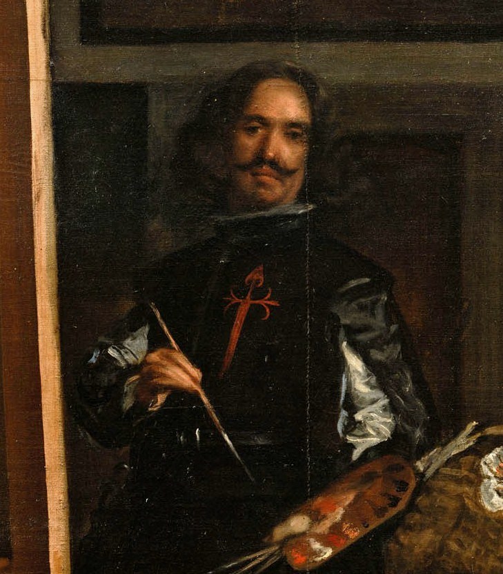
It’s no coincidence those paintings are included or that the setting is in his studio; it’s absolutely by design. Velázquez literally painted a painting about painting that contained a symbolic argument for the divine celebration owed to his profession… using other contemporary painters’ paintings as well as his own!
Perhaps his facial expression is Ozymandian in its own way, expecting us to acknowledge his genius and the unjust status of art in his day.
With any luck, unlike the titular king of Ozymandias, his work will always remain to be admired.

How can you design your own Las Meninas?
Obviously, there’s a world of difference between great UX and great painting. But really, Velázquez was thinking and working in a way not unlike many UX designers in 2019 are.
Although the idea of creating a website or user experience that is aware of its users seems a bit like science-fiction, there are several conceptual tenets that apply to both. Think of Velázquez as a the chief UX designer for a company (the Spanish Empire) with a project manager (King Philip IV) who appreciates his work, if not totally understanding it. Sounds fairly familiar, right?
With Las Meninas, Velázquez designed an experience because he was aware of several things that UX designers today should also be acutely aware of:
Know your industry: Velázquez was a portrait painter during the Baroque period. That meant he had to meet certain technical requirements and restrictions when it came to his work. If you replace “technique” with “industry standards,” you might begin to empathize.
 Painterly Realism of a Peasant Woman in Two Dimensions (AKA Red Square), Kazimir Malevich c.1915
You can’t paint a red square in the middle of a white canvas and call it a portrait, at least not in 1656, the same way you can’t make a “cart button” be shaped like an octopus in 2019. You adhere to the style of the time, while finding subtle ways to make the work inherently yours.
Know your audience: To some extent, Velázquez must have known that his paintings would endure and stand the test of time (both physically and figuratively). After all, they were safely located in the Spanish palace and he was already internationally renowned. He must have supposed that people would continue to look upon his work in the future when, like Foucault argues, new ways of thinking would emerge.
So he painted familiar figures in a Baroque style for his boss and the company, while stuffing in layers and layers of high-concept ideas to be analyzed by historians, critics, and philosophers for the rest of time.
In UX, going high-concept or getting too clever can be very dangerous. However, unlike painting, you don’t have to create something that will become immediately static. Instead of playing 4th-dimensional chess like Velázquez, just try not to shut yourself off to shifting trends, evolving audiences, or even major company pivots.
Usability testing, like art criticism, is always readily available to help your team discover new interpretations, strengths, and weaknesses for any website or app.
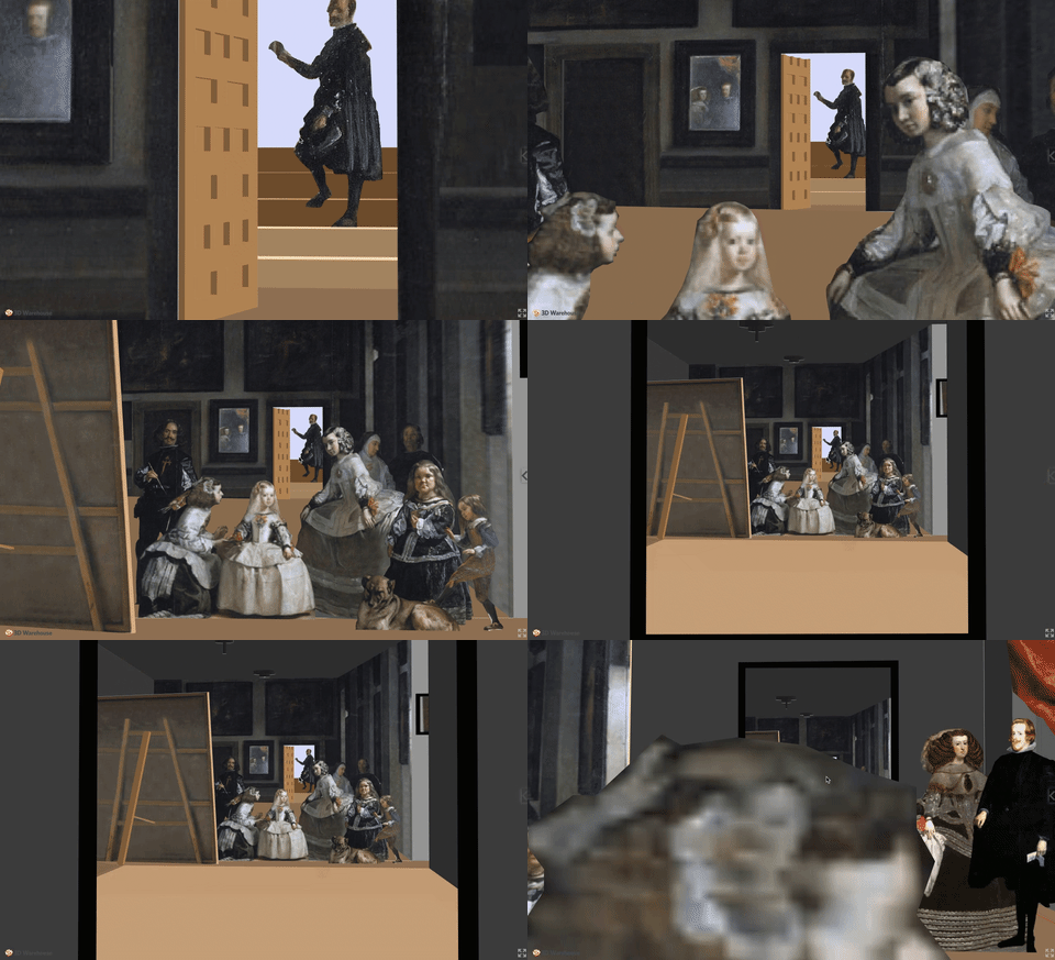
Create an experience that welcomes and rewards: Abstractly, Las Meninas can offer an enormous variety of experiences per viewer. But, like with great UX design, Velázquez ultimately crafts an experience that is welcoming, in its size and multiple focal points, while also rewarding viewers who continue to look around and consider the painting.
When it comes to UX, you similarly want create an experience that is immediately intuitive and welcoming. But, you must also consider the multiple paths a user can take and plan accordingly to ensure a coherent experience as they explore the nooks and crannies of your UX design.
Las Meninas is conceptually a very dense painting, or at least the academia surrounding it is. Regardless of artistic intention or definitive answers, Las Meninas, after nearly 400 years, remains shrouded in mystique.
“A painting as rich in ambiguity as it is in subtlety, Las Meninas has long been recognized as a masterpiece of Western art, a pictorial tour de force rarely equalled and never surpassed. But when we attempt to explain its greatness, we soon realize how it seems to evade the grasp both of intuitive and rational understanding.” -Jonathan Brown, Professor of Fine Arts, New York University
Las Meninas is a timeless painting, no matter how you look at it, and Diego Velázquez will always be watching you watching him.
You may be interested in:




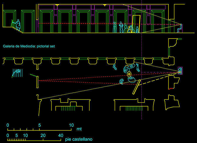 Las Meninas, reconstruction of pictorial set and visual field: plan and section (source: Luigi Cocchiarella)

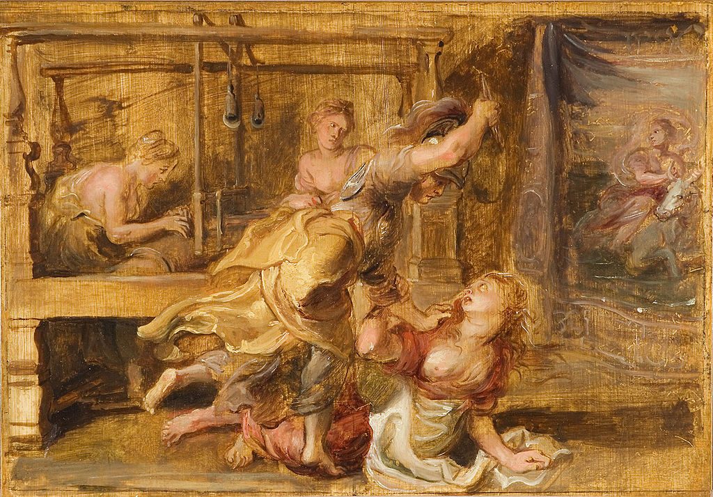 Pallas and Arachne, Peter Paul Reubens c. 1636-1637
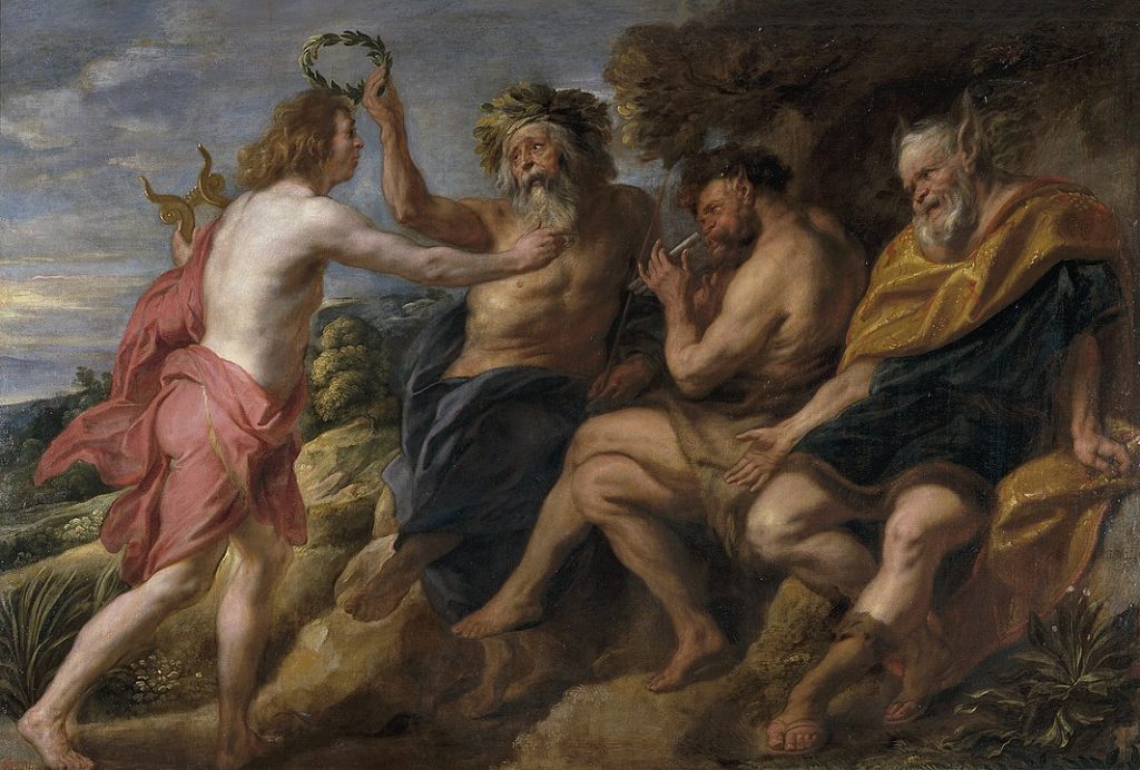 Apollo as Victor over Pan, Jacob Jordaens c. 1636-1638
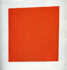 Painterly Realism of a Peasant Woman in Two Dimensions (AKA Red Square), Kazimir Malevich c.1915