“You X …” is a recurring series on creative ideas and interesting stories to inspire great UX design. You X Horror volume II is the fifth installment in this series.
In 1982, John Carpenter (Halloween, Escape from New York) released what many consider to be one of the greatest horror films ever made: The Thing. An adaptation from an 1938 novella, the film follows a group of American scientists and staff located in a small Antarctic research station who encounter a long-dormant alien creature that assimilates other organisms and assumes their identity.
R.J. MacReady, or “Mac,” a helicopter pilot portrayed by Kurt Russel serves as our protagonist.
Although it’s a body horror masterclass of filmmaking, like with most things in life, UX designers can find inspiration in the paranoid fever of The Thing for their own research and design process.
Spoilers follow.

Assimilation and absorbing feedback
The Thing, which is how most people generally refer to the alien, survives by assimilating living organisms and assuming their identity. From dogs to humans, given enough time to morph its body, the Thing can become anything. Obviously, the process kills the host.

Paranoia is the primary horror of The Thing. The practical effects are gruesome and effective on their own, but the greater existential threat of being surrounded by intruders seeking to invade your body is what The Thing does so well. The paranoia permeates with every glance and movement a character makes.
For those who enjoy rewatching movies, the timeline of infection is never clearly stated, leaving audiences to guess when and how a human becomes a Thing. Even the actors didn’t know if or when their characters were Things until the scene in which they were revealed to be a Thing, or die human.
Do more: Is your GUI also gruesome? Test it with TryMyUI!

Absorb your users and their feedback
You are not your user, just as the Thing is not human. But that doesn’t stop the Thing from successfully passing itself off as a human, in both speech and behavior. Like the Thing, UX designers and researchers must be able to take feedback from user testing videos or surveys and incorporate them into their designs.
That might seem like the obvious point of usability testing, but as anyone in the UX field will tell you, being humbled can hurt. Distancing yourself from your design through the eyes of the user is an invaluable exercise.
National Geographic learned via TryMyUI that dealing with negative feedback is more important than getting praised:
“While that UI failed, I think that means that the test was incredibly successful, because now we know not to build that version of the UI.”

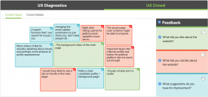
TryMyUI’s UX Crowd exclusive crowdsources and ranks user opinions and sentiments. With tools like this, UX design teams can reliably quantify qualitative data and get top-line feedback on their designs very quickly. And, like with all of our data points, it’s super easy to share and interpret!

Blood tests and proving value to stakeholders
In perhaps one of the most iconic scenes of The Thing, MacReady devises a test to prove the identity of the remaining crew. After previously seeing the Thing’s desperation to avoid fire, splitting into multiple pieces of itself, Mac believes every individual cell of the Thing will fight to survive. And since at this point, the entire rest of the crew thinks Mac might be a Thing, he similarly can’t trust anyone.
So, flamethrower and dynamite in-hand, he forces one member to tie everyone else to a couch and takes petri dishes of blood from them. Mac then heats a copper wire with the tip of his flamethrower and submerges it into the petri dishes.
He believes blood from the Thing will react, while human blood will do nothing.

Stakeholders
Short of tying your project managers or other such stakeholders to a couch and cutting their thumbs open, there are lots of ways of conveying the value of UX design and research. The best way to get stakeholders on-board is often by showing them. Start with a free trial and continue reading.
Identify what needs to be improved. Is it the menu hierarchy? Checkout flow? Text placement? You will most likely have a natural instinct on something that just isn’t working. And if you’re not sure, even just an impression test can convince a stakeholders that something is wrong.
Read more: Is your website stressing visitors out?
Next, setup your test! We have a few templates available for reference as well! Maybe you’re just interested in A/B testing?
TryMyUI will collect meaningful data points that make sharing to stakeholders extremely simple. But even better, take these data points and use them as a shortcut to immediately view the user’s video recording so stakeholders can see and hear the data come to life!

There’s always one last test
At the end of the film, MacReady has successfully blown-up the compound and, he believes, has killed the Thing. He sits on the ground in the arctic night while the camp burns around him, clutching a bottle of whiskey and his flamethrower.
Suddenly, to his surprise, Childs, a crew-member who had earlier ran into the arctic for unknown reasons, emerges. Mac and Childs seem wary, but exhausted, and as Mac says, “if we’ve got any surprises for each other, I don’t think we’re in much shape to do anything about it.” They agree that there’s nothing left but to wait to die, and Mac passes Childs a drink, which he takes.
Fade to black. The end.
But the fan theories and speculations abound!
MacReady’s bottle test
Although MacReady is definitely a human, there are several reasons to believe Childs isn’t (and also, is). Specifically, there’s an interesting theory that Mac tests Childs by innocuously offering him a drink of his whiskey. The first rule the crew enforced was that, due to the way the Thing can infect its hosts, everyone prepares their own food and drink, preferably from cans and bottles. No sharing.

Childs was one of the most determined and obviously human crew members, but he accepts Mac’s offer readily, causing Mac to chuckle to himself. Many point to Childs drinking the whiskey and Mac’s reaction as evidence that the latter was testing the former, and now knows their true alien identity.

Your sprint test
MacReady had already proven how to uncover the identity of the Thing with the blood test, but just like with usability testing, he was prepared for another test just when he thought it was all over.
The importance of retesting after you’ve made changes based on your initial tests cannot be overstated. Although you feel pretty good about your changes, just as Mac felt good about defeating the Thing, you must be ready to test again.

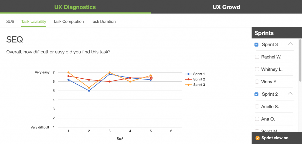
TryMyUI’s UX Sprint features makes the comparison between new and old design extremely simple in our UX Diagnostics panel. Visualize not only the task-by-task SEQ (single ease questionnaire), but also compare benchmarked scores of the psychometric you chose with the click of a button!
Learn more: Measuring Task Usability: The Single Ease Questionnaire
The cosmic horror of other user testing platforms
 What’s scarier than a hostile alien imposter? How about a user testing “service” that requires annual contracts, limited test creation, and no quantitative data?
TryMyUI can be your month-to-month MacReady! With no limits to test creation, draw all the blood you want! I don’t really know how to connect our vast quantitative data offerings to The Thing, but we’ve got’em!
Try our free trial! 14 days, full features, 5 video test results of your targeted demographic interacting with your designs! No credit card required!


