Trymata’s quantitative UX Diagnostics are a powerful complement to the qualitative feedback found in your user test videos and written responses.
Our UX Diagnostics suite comprises up to 5 different types of UX metrics to help you quantify users’ experiences on your digital products. These 5 metrics are:
- System usability psychometric scores
- NPS customer loyalty scores
- Task usability scores
- Task completion rates
- Task duration times
With Trymata UX Diagnostics, you can measure your products’ overall usability and user perceptions with psychometric analysis, and map usability fluctuations along the user’s journey with task-specific metrics like usability, completion, and duration.
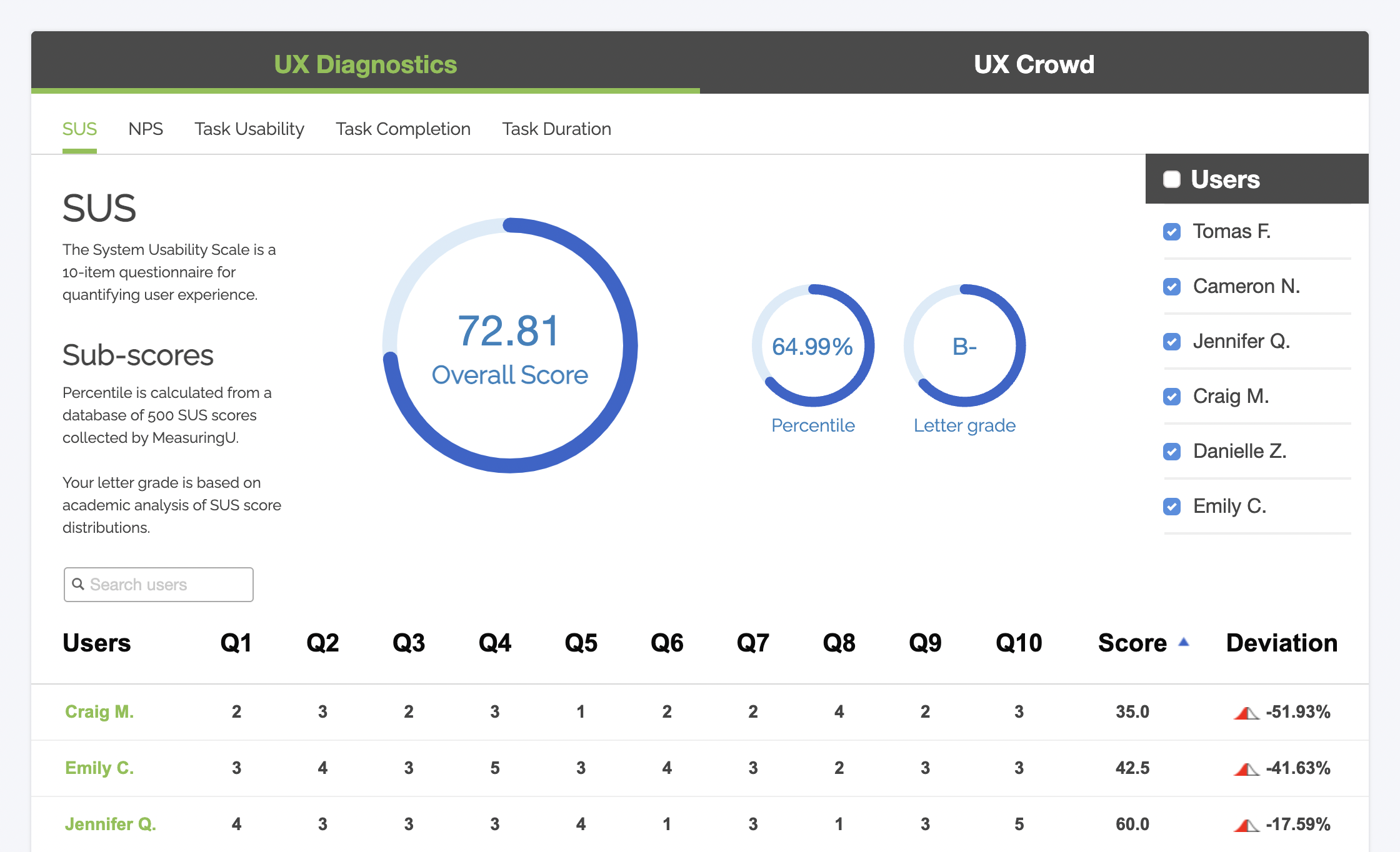
System usability psychometrics
When setting up your usability testing study with Trymata, you can choose from a number of built-in, standardized psychometric survey models to collect quantified experience scores from your testers.
Each standardized survey model asks users questions about their experience after finishing a usability test session, and then turns their responses into a numerical score out of 100. A score of 95, for example, indicates that the user had a great experience; while a score of 25 would represent an unhappy user.
For more information about our standardized psychometric models – and tips on which one to pick for your test – check the following resources about all of our built-in options:
- SUS (System Usability Scale) – the most famous, most widely used, and also most basic psychometric model
- PSSUQ (Post-Study System Usability Questionnaire) – created to specifically measure usability during a scenario-based user test
- SUPR-Q (Standardized User Experience Percentile Rank Questionnaire) – a more holistic model that factors in usability, trust, loyalty, and appearance
- ALFQ (Adoption Likelihood Factors Questionnaire) – for quantifying new users’ perceptions and interest in a digital product
- AUS (Accessible Usability Scale) – a variant of the SUS, for measuring usability while using assistive technology
- SRS (Survey Respondent Scale) – another SUS variant specifically for evaluating the user experience of taking a survey
You can run your first usability test for free and get your choice of psychometric scores when you sign up for a 2-week free trial of Trymata >
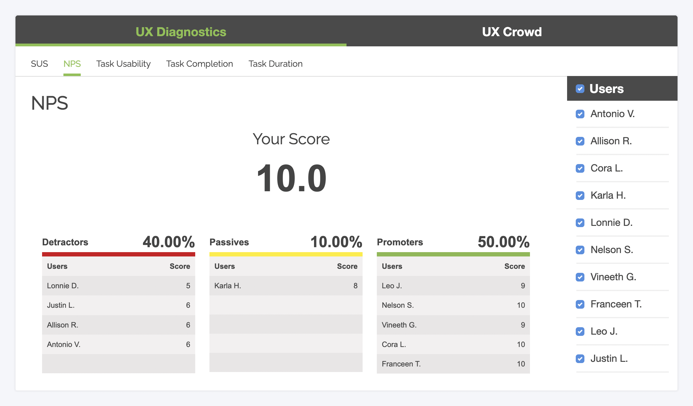
NPS (Net Promoter Score)
The Net Promoter Score is another standardized metric for gauging overall user perceptions. Traditionally, NPS has been used more in marketing and market research spheres for estimating customer loyalty. However, it’s a useful datapoint for UX researchers to understand user attitudes as well!
Task usability scores
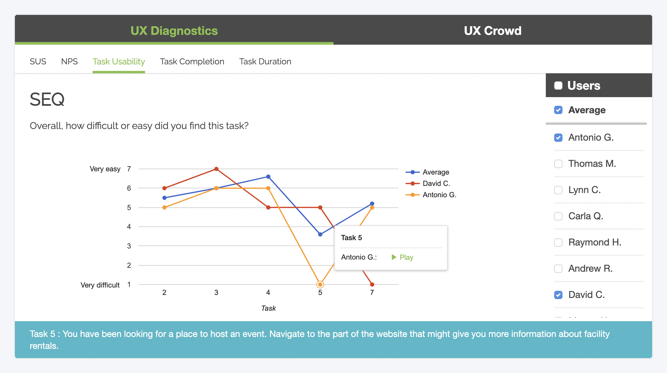
For measuring task usability, we’ve built in the standard SEQ (Single Ease Question) model. The SEQ is a simple but effective metric designed to measure the usability of specific tasks in a task-based usability test.
Upon completing each task, the user responds to a single precisely-worded question: “Overall, how difficult or easy did you find this task?” The response scale goes from 1 to 7 – “Very difficult” to “Very easy.”
When viewing your user test results, you can see a graph of the average usability rating for each task in your study, as well as individual users’ graph lines (see above). Each point on the graph is linked to the corresponding video clip, so you can instantly identify UX problem spots and jump to those moments!
Read more: See exactly how real visitors are traveling through your site with Trymata Product Analytics
Task completion rates
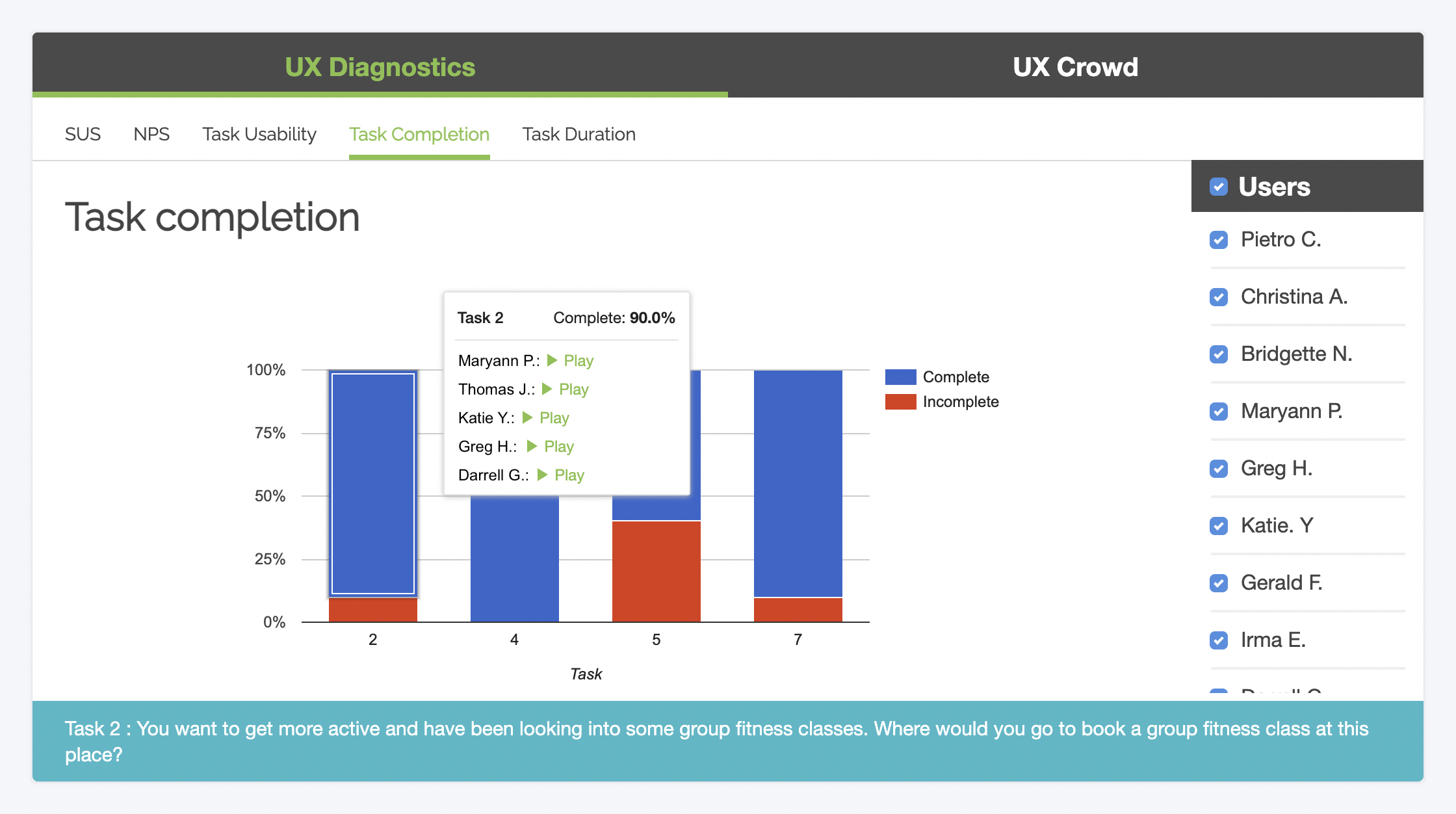
To get a quick snapshot of where testers are struggling the most throughout your user flow, you can include a simple task completion question at the end of the tasks in your script.
Immediately after attempting a task during their video session, the users will then indicate whether they were able to successfully finish it, using “Yes” and “No” answer buttons.
When viewing your test results, you’ll get an automatically generated bar graph (as shown above) that shows where any “incompletes” occurred. The graph is linked back to your video recordings, so you can find and instantly watch clips of incomplete tasks.
Task duration times
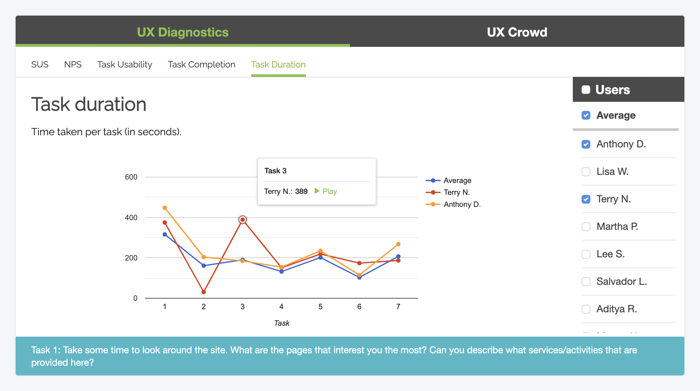
With any Trymata usability test, you’ll also get time-on-task data automatically. Our test facilitation software saves the timestamps at the start and end of each task in every user video, and then calculates and graphs the task duration times for you.
You can view the average per task for all users in your study, as well as the graph line for any individual tester who participated. This allows for easy comparisons to see which users took much longer or shorter than was typical for the dataset, or to identify any other interesting patterns or trends.
Like our other task-based metric graphs, this one is also linked back to the user videos. So if we wanted to see, for example, why Terry (in the example dataset above) took so long on Task 3, we can get there in 1 click.
Run your first user test free, with all our UX Diagnostics features:


