


There is a problem I have with the UX on a number of news websites, and it’s become something of a pet peeve of mine. Here’s a pretty typical example from a few days ago…
I was reading an article on Slate about the psychology of altruism, and as my eyes tracked down the page my hand reached over to the arrow keys. I use the up and down keys a lot to scroll through articles so I don’t have to take my eyes from the text and lose my place; that means I don’t actually look when I reach for the down arrow, instead making my best guess based on feel.
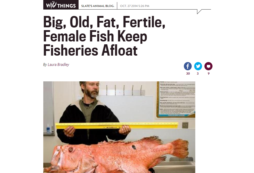
This time – not for the first time – I misjudged, and my finger struck the right key instead. The article I was reading disappeared before my eyes, replaced with a headline about “big old fat fertile female fish.”
So there I was, staring at this picture of a hideous overgrown pink fish-out-of-water, waiting for the wrong page to finish slowly loading (the sidebar and ads are always the worst offenders) just so I can go back to the content I wanted to read in the first place.
Once the page was all there, I pressed the left key to get back to my altruism article – and nothing happened. Flying in the face of intuition, the left key does not in fact return you to the last article, even though the right key takes you to the next one. I almost pressed the back button, but by that point it didn’t seem worth it anymore to wait through another page load.
Slate is not the only website that does this. The New York Times, too, has frustrated me in the same way as I’ve tried to read articles on their website; but at least the New York Times sends you back with a left key press. And there are many more.
Of course, there’s a reason why some news sites do this. It’s an easy way to marginally increase page views at the expense of the (presumably smallish number of) people who make that same mistake. But do page views really count more than positive, meaningful user interactions? That is the tradeoff that such a choice represents. Users feel frustrated and taken advantage of, or at the very least like their interests have been disregarded. And that affects your brand – really, your UX affects your brand at all times, always either strengthening it or detracting from it. Perhaps for these websites it is worth the page views – for news sites whose primary aim is usually not conversion to a purchasing customer, page views matter more. If nothing else, it is a decision that should at least be made with all the side effects in consideration.
You may be interested in: How bad design ruined Miss Universe
3 Takeaways:
- Don’t trick users into doing something they don’t mean to do. Your website should always be predictable, so users can successfully achieve their goals on your site. People don’t like to be surprised or interrupted, and they tend to leave a site when they get frustrated with it. Remember that they can probably find the same service elsewhere with relative ease, and if you aren’t creating a positive connection with your users you easily lose them.
- Your navigation should be internally consistent. If a right arrow key press takes a user to the next article, then a left arrow key press should take them to the previous one. Whatever your navigation system, ensure that it’s internally logical and that when it creates expectations in the user, those expectations are met. Not doing so makes it much harder for people to learn how to use your site.
- Build your brand before your metrics. Put the human side first, and users will appreciate it. People don’t like being treated as data points to be manipulated and maximized. They can sense when your site doesn’t respect them, and this has an adverse effect on your brand. Make users feel good about you, and they’ll keep coming back. That should make up for the page views.
If you’re not sure if you’re doing these, maybe it’s time to get some real people’s opinion with usability testing.