You probably know that you can run remote user testing studies with Trymata. Most of the tests that our customers run are pretty standard, traditional user tests. But the flexibility of our platform actually allows you to do a lot more than that! Over the years, our customers and our own internal research teams have come up with all sorts of outside-the-box ways to use the platform.
The 5 ideas described below are tried-and-tested ways for you to easily get more out of your user testing research with Trymata!
1. Test your competitor’s website
When you set up a Trymata user test, one of the first things you fill in is the link for the website you want to test. Since most organizations are typically hyper-focused on validating their own designs and optimizing their own products, they don’t even think twice when pasting in their own website link.
The fact is, you can put any website link in that textbox! Any site or app that’s publicly reachable on the internet is fair game – and since our testing solution doesn’t require any integrations, there’s nothing blocking you from setting up a quick test on your #1 competitor’s website to see what users think of it.
There are a lot of benefits to running a usability test on your competitor:
- You can learn what users like about their platform, products, and UX, in order to better compete and create attractive experiences & offers of your own
- You can see what innovative new ideas and features they may be implementing, and get ideas for innovations within your own platform
- You can find out what users dislike (or simply find insufficient) about your competitors, so you can capitalize on those aspects or meet real user demands that the competition isn’t satisfying
Running user tests on a competitor’s platform is a great way to stay abreast of UX, marketing, and design trends in your industry, and keep your eyes fresh. Every business needs to stay competitive, and competitor user testing lets you keep a pulse on how to do so.
Plus, it’s incredibly easy with Trymata! If you have a user testing plan with us, it’s well worth spending a few of your monthly or yearly credits to see what your competitors are up to – and how users are receiving it.
Want to run your own competitor test? Get started with a free trial! >
2. A/B testing
Most of the time, in a usability test you want to drill deep into just one user flow and see what people think of that experience. However, A/B testing a few different flows, design versions, or websites can add a ton of value to your research.
While Trymata doesn’t have a “built-in” A/B test format, it’s very easy to create one using our platform. You can run A/B tests on prototypes to see which of your design versions offers the best user experience, or you can send users to multiple websites within a single session to have them compare and contrast them together.
We won’t go into a ton of nitty-gritty details in this article, since we’ve already written about how to run A/B tests with Trymata. There’s actually a few different ways to go about it – just pick the method that makes the most sense for your situation!
Read more: Writing tasks for prototype user testing
3. Get users’ first impressions
While the bulk of your user test videos will consist of users navigating through a complete journey on your website or app, you can also choose to include an extra “first impressions” test with every video!
The Trymata impression test is available at every plan level, and doesn’t cost any extra to add to a test. If you include it, we’ll have each tester start their session by opening up your landing page for just 15 seconds on their screen.
Within that 15 seconds, they’ll be able to scroll around and look at what’s on the page, but they won’t click anything or navigate away. Then, we hide the page again, and ask them questions about what they remember, how the site made them feel, and what kind of products or services they think it offers.
The impression test is a great way to add another layer to the insights you get from a Trymata usability test. It will give you a powerful window into users’ perception of your brand and messaging, and what kind of tone you’re setting right off the bat.

4. Quantify your UX
Usability testing is primarily a qualitative exercise. However, that doesn’t mean you can’t engage in some quantitative data analysis too – and our platform makes it easy!
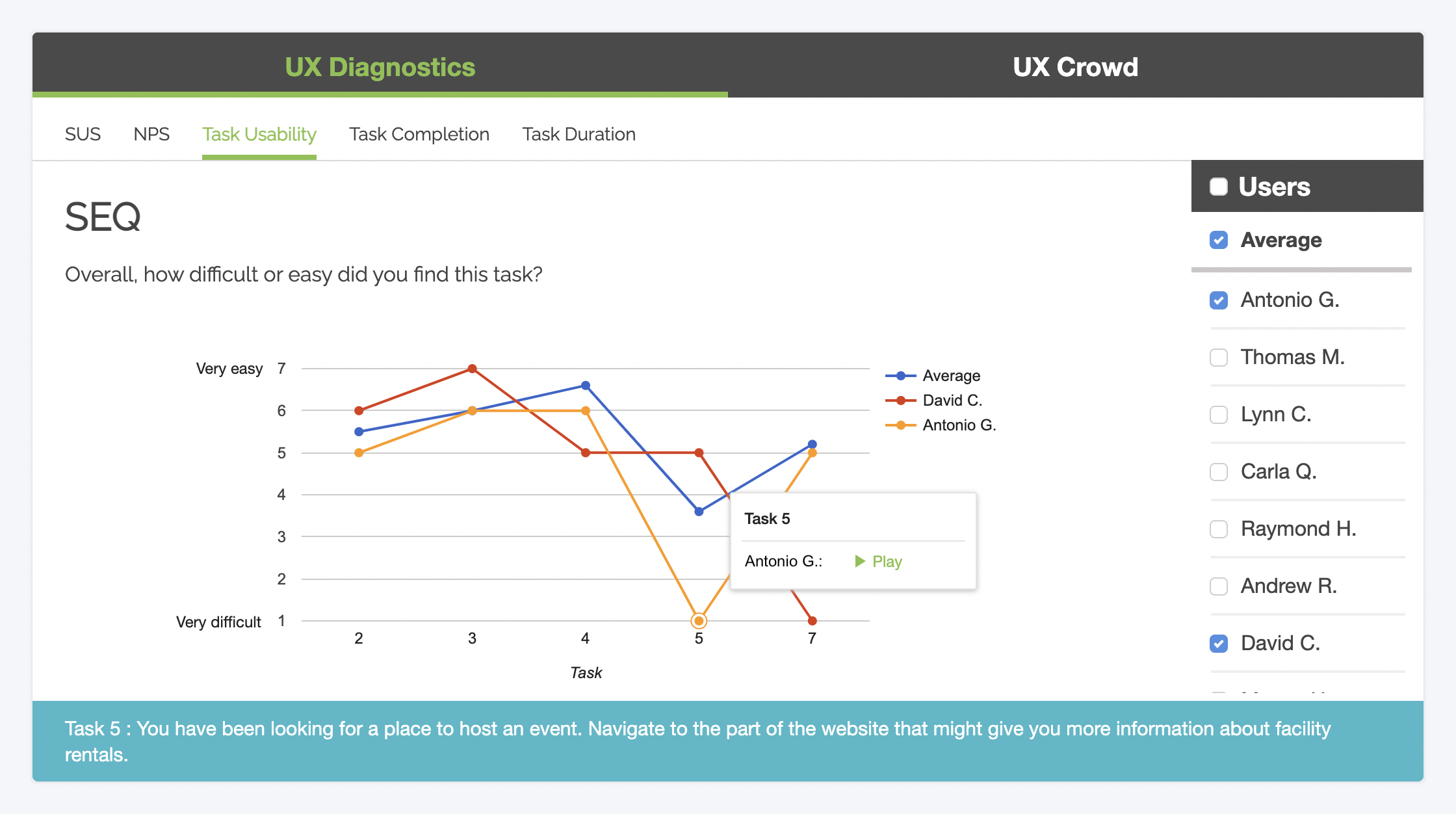
When you set up your user test, Trymata offers a variety of built-in standardized UX metrics that you can include. Whether you want to measure task usability, completion rates, or your website’s overall user experience, you can add metrics for any of them (and more) with just 1 click.
That’s because we’ve adopted proven, industry-standard models for measuring each of these UX aspects, so you don’t have to worry about setting up the questionnaires, response scales, and scoring algorithms yourself.
For example: Want a SUS score for your website? Select it from our dropdown list of ready-made survey options. When your results come in, you’ll get a SUS dashboard right at the top of the page that displays your total score – with plenty of interactive options for diving deeper into the data too.
With Trymata’s quantitative features, you can measure your UX performance and quantify exactly how well you’re doing, and how much room you have to improve!
5. Run iterative sprints (and compare your results!)
An organization that truly cares about better UX doesn’t just test once – you iterate!
Our user testing platform was designed to enable exactly this kind of mindset, making it easy not just to run a new sprint, but to compare new & old results to see what’s different.
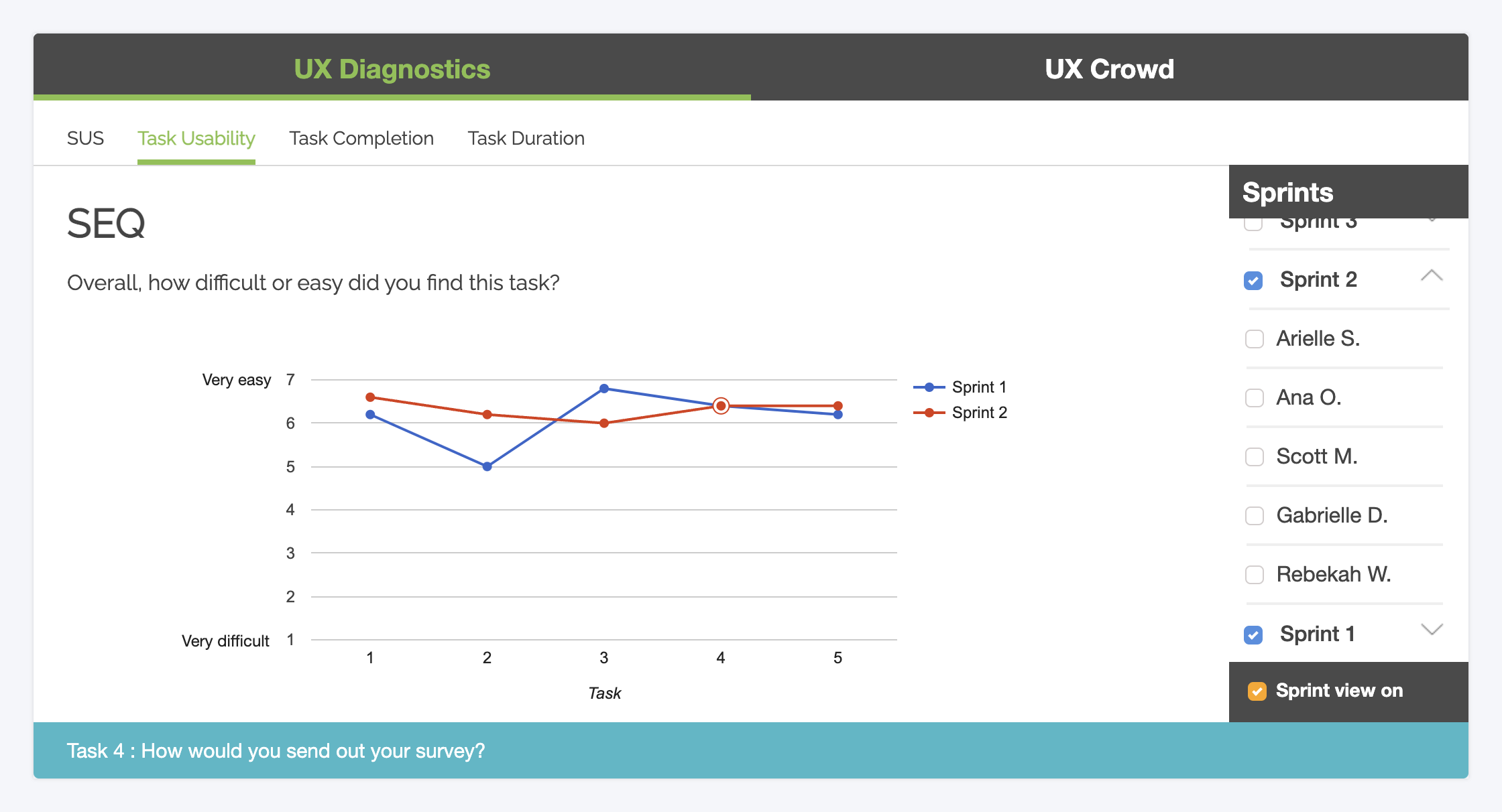
On every user test you run with Trymata, after your results come in you’ll have a “New sprint” button at the top of the test page. Just click it, confirm your sample size, and then launch the new sprint order in one click!

When the new batch of tests come in, they’ll be automatically sorted by sprint. Your quantitative graphs will compare the before-and-after numbers (like in the screenshot above). So for example, if you want to see whether Task 2 got easier after you redesigned and retested it? Just check your Trymata graphs to find out!
Automatic sprint comparison allows you to make objective decisions about your design direction, and back up your decisions to stakeholders with solid evidence. And it’s all built-in with Trymata!
Run your user research your way with Trymata
Our usability testing platform is the most flexible and robust on the market, with the tools you need to run your UX research the way you need to. Whether it’s competitor testing, first impression testing, quantitative sprints, or more, we’ve got you covered.
If you want to see Trymata in action for your designs, get started with a no-commitment free trial below:


