Usability testing almost always uncovers some problems you knew about, and some problems you didn’t. The more you test, the better your instincts become for predicting how users behave and what they will understand or be confused by.
Users across demographics will react similarly to the same kinds of UX mistakes. That means that broad lessons can often be drawn from feedback about a particular website or app. Here are 5 UX lessons from user quotes we’ve heard in our own user testing research.
Read more: 8 usability lessons from our favorite user quotes
1. Search can make or break your UX
For any site offering a catalog of products for sale, a good search function is integral to creating successful experiences.
A sub-par search function, on the other hand, can turn a user session into a futile struggle. One user from a study of online auto sellers became hopelessly frustrated after repeated searches failed to return the results he was looking for.
Used, any year, four-door… Ok, they have 6 four-door vehicles. Let’s see what they are. And they show 3 of them, with no pictures. [bites tongue] And none of those are sedans. Those are all SUVs.
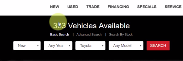
After a few more similar attempts, he exclaimed, “This is one of the little things that makes people hate shopping for cars. This is quite frustrating.” The user went on to rate the usability of the task a 2 out of 7, and wrote in his post-test survey that “It looked good, but the search feature was horrendous.”
Remember, aesthetics won’t count for much when critical functions aren’t usable.
The same lesson surfaced during usability testing of Google’s online general-store, Google Express. As users sought to buy up a list of office supplies, some found the search giant’s search function lacking:
Let’s just search “legal pads.” Now, why am I getting non-legal pads in this?
How much did it affect this user’s experience? “I probably would have exited and gone directly to a site like Staples,” he said at the end of the test. Search is a feature you can’t afford to not nail.
2. Illogical information architecture wastes users’ time
It would seem that some users are “searchers” and some are “navigators.” Given the exact same task, a searcher’s first inclination is to type something into the search bar and go from there, while a navigator will click through headings and categories until they find what they want.
That means your information architecture will be as important to your navigators as your search function is to the searchers. Illogical categories and poorly designed navigation options can set these users back precious seconds or minutes.
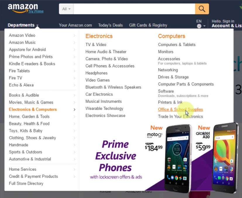
Amazon, for all its success in ecommerce UX design, proved to have some serious flaws in this area. One user spent 51 seconds just perusing the massive “Departments” dropdown looking for office supplies before finding them under “Electronics & Computers.”
I really thought there would be something which would clearly say office supplies.
Next, she began searching the sub-menus along the left-hand side for notepads, which didn’t seem to fit clearly in “School supplies,” “Paper,” “Writing,” “Organization,” or “Office basics,” yet could have been in any of them. After looking through each menu, she sighed, “Let me come again from the start, it’s a bit overwhelming here so let me just go through one by one.”
It took her 3 minutes and 11 seconds to finally locate the notepads. This would be an absolute death sentence for most ecommerce user experiences.
Apparel store Forever 21 had navigation issues of their own. Users looking for a winter cardigan struggled to guess where the next step would be on their screen – first, categories were arrayed along a bar at the top; then, in a hamburger menu on the side; lastly, in a dropdown button from the top middle.
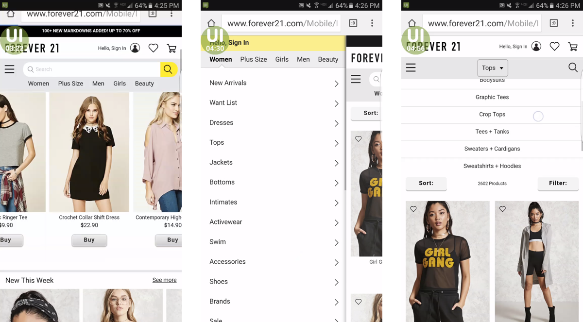
That is…interesting that they separated it and made a whole ‘nother dropdown menu.
From beginning to end, it took this user 2 minutes and 14 seconds to get to the page with sweaters and cardigans.
In both cases, better category groupings and more logical navigation options would have shaved huge amounts of time from these users’ searches. Usability testing and other research methods like card sorting can help to determine the best way to arrange your navigational architecture.
3. Be wary of trading clicks for credibility
Clickbait-style links can increase target metrics like clickthroughs and pageviews, but they also risk damaging your credibility.
One user during a test of the BBC’s website mistook a row of article links at the bottom of the page for external ads due to their over-the-top images and clickbaity titles.
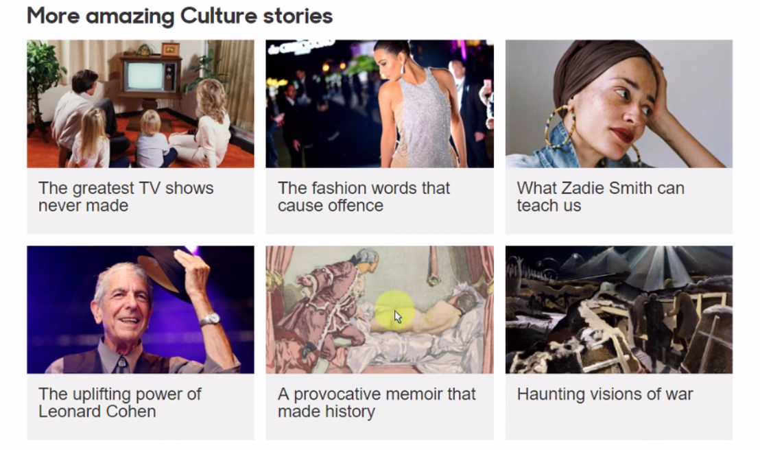
I never liked…the links like these. Like ‘Are these waxworks disgusting?’ I just don’t understand why these links have to be there. And its not only here, see – ‘A provocative memoir that made history.’ So these pictures are attractive, but I don’t think these are BBC links, these are from someone else. I have seen this with other newspapers.
Be mindful of how users will perceive elements on your site. In this case, the BBC tried so hard to get clicks that they damaged the credibility of their own links by appearing like low-quality promoted content.
4. You can nudge users, but don’t be overbearing
This one is another case of leaning too hard on one strategy. Pushing users to do something you want can easily become pestering.
For example, the Toyota Knoxville website has a chat window where users can talk to a representative. But the window re-opens up (and covers part of the screen) every time the user visits a new page.
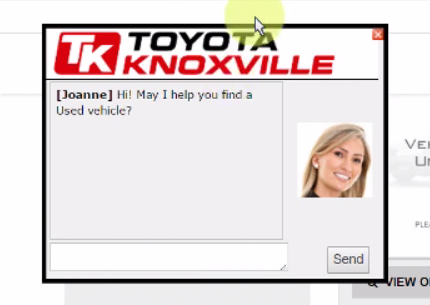
“We do not want to chat. Thanks, Joanne, but no thanks” was one user’s response after a few times seeing the popup window. The next time, it was:
Johnny, I’m sure you’re a nice guy, but go talk to somebody else.
On the H&M website, a scrolling banner advertising promo codes, shipping rates, and a free returns policy was displayed at the top of most pages. At first users like it, but when it kept showing up, it got annoying:
And again we have that scrolling text, which is a little bit too persistent.
It’s hard to know exactly where each user will draw the line, but researching and testing with users can help to find a balance.
5. Never underestimate the value of white space
While testing the New York Times, we got feedback from one user who was viewing the site on a large screen and had a lot to say about the Times’ use of white space.
I like the use of empty space on both sides here, just kinda takes some strain off of your eyes, you know, from having to read all the way left, all the way right… It definitely makes my eyes feel better as I’m looking across the screen.
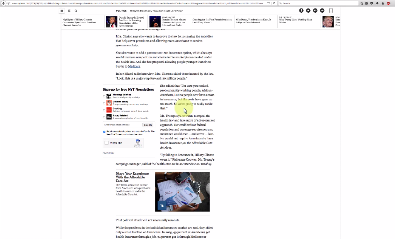
It’s pretty obvious from the way she discusses this that a lot of sites do make her read all the way across her monitor. The fact that the New York Times uses this center column format with plenty of white space around the actual content is even more valuable for this reason. Later on in the test, she brings it up again:
I felt like the site did a really good job to reduce eye strain, there were no garish colors, wasn’t any ads or video content, that was refreshing to see. And the blank space on either side, somehow that did a lot for me to reduce that strain… I operate on a pretty wide monitor here, so that really helped me.
Don’t underestimate the power of being kind to your users’ eyes.
There’s another lesson to be learned from this: consider all the different devices your users may be on! Not everyone will view your website on a screen like yours. In fact, one advantage of remote user testing over on-site testing is that you get to see the variety of screens and devices that people are using.
Conclusion
Usability testing is an opportunity to not only learn about your own website or app, but also to grow your user intuition. There’s often larger lessons to be learned from the patterns you see in your UX research.
What are the most valuable UX lessons you’ve learned from listening to users?


