For music lovers around the world, Spotify has become the go-to for streaming and sharing music over the past few years. However, with its new music streaming service entering the ring last week, Apple has set out to challenge that market dominance.In April, we tested streaming newcomer Tidal to see how it measured up to the industry’s established giant. This month, we ran a few tests with music lovers once again to take a closer look at Apple Music’s UI, and see if the latest addition to the streaming world might succeed where Tidal failed.
Task 1: Register for Apple Music membership
Give users what they expect
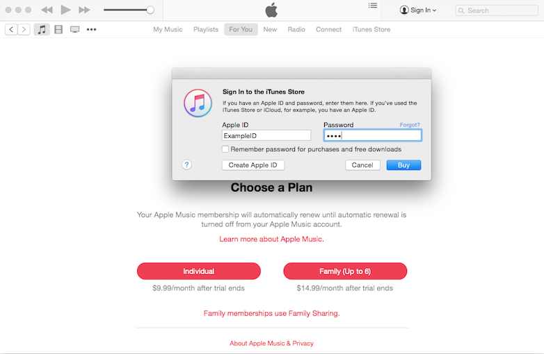
The 3-month free trial Apple Music offers is a smart move that has already drawn a lot of adopters. However, once users get past the landing page, there is almost no mention of the free trial. And when users click on a signup option (“Individual” or “Family”) the resulting popup prompts them to either “Buy” or “Cancel” — a confusing choice to someone who was trying to sign up for a free trial.
The confusion continues when the next page asks for credit card information. “Is this still the free trial? Why do they need my credit card if the first 3 months are free?” asked Paul from Indiana at this point. Other users expressed similar doubts.
After inputting their credit card information, users are greeted by another popup asking, “Do you still want to buy Individual Apple Music membership for $9.99?” This question is thrown at users more than once in a series of frustrating popups that also repeatedly asks users to sign in with their Apple ID every step of the way.
As we see customers struggle with the signup process, 2 takeaways for improving the user experience become clear:
1. Give users what they expect. Presenting people with a “Buy” option when they are trying to sign up for a free trial only adds confusion about whether they are following the right path. A “Start free trial” button would be more intuitive.
2. Don’t create extra obstacles. Asking users if they “still want to” move forward makes them think twice about their purchase, which may implicitly discourage some from continuing. The other (clearly redundant) popups during the signup process created additional annoyance as well.
Task 2: Pick your favorite genres and artists
More options, please?
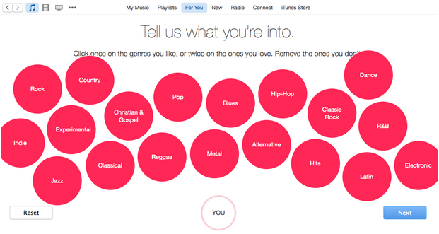
Immediately after signing up for membership, users are asked to communicate their music preferences to the app by clicking on red bubbles that bounce gently around the screen.
While clicking on bubbles is a novel and fun way to choose music preferences, it also presents some usability issues. For example, Juliana from New Jersey found the bubbles somewhat difficult to click on as they bounced around the screen, accidentally clicking on genres she didn’t like several times (some of them even bounced off the screen).
The bubbles’ constant motion also makes it hard to remove less-liked genres and artists, with the little hovering X button sometimes floating out from under the user’s cursor.
Another potential problem arises with the categorizations themselves. To some people, they are lacking in specificity: for example, “rock” is too general for someone who only enjoys Britpop rock. This is more of an issue since you can’t go back and update your preferences later.
Task 3: Listen to a few tracks by your chosen artists and add them to your playlist
Be nice to first-time users
Apple Music is built as an extension to the existing iTunes framework. For people who are not familiar with iTunes’ layout, though, the icons can be confusing. For example, what does the heart icon next to each song do?
There is no explanation of the hearts, and the library column for them doesn’t even have a label. How is it different from rating? What happens if you “heart” a song that you haven’t added to your music? Can you re-find hearted songs that you haven’t saved?
Other icons add to the confusion: What are the checkboxes in front of each song for? What does the cloud-shaped icon do? No obvious explanation is offered.
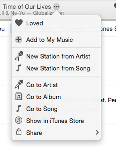
One of the most important features for a music streaming service is to create and add music to playlists. However, Apple Music manages to make this step extremely hard to do for new users. There isn’t any indication of how to save songs to your library until you hover your cursor over the song title, after which a tiny circle with 3 dots appears. This little icon opens a dropdown that allows users to “Add to my music,” among a number of other options.
You can’t even directly add songs to existing playlists without first adding them to the main music library.
Additionally, some users ran into problems trying to play music from the search results; when Juliana tried clicking a song title, it took her to the album page instead of playing the song. To actually play it, users must click on the small “Play” arrow on the album picture to the left of the title.
Other users felt the search results page was “cluttered and unclear,” in the words of Andrew from San Diego, who compared it negatively to the Spotify results page.
Lastly, it was unclear for many users how to make songs available offline.
Task 4: Explore the public playlists
Explaining to do
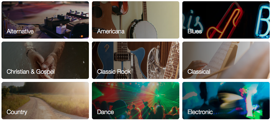
Apple does a good job providing a unique selection of public playlists categorized into “Apple Editors Playlists,” “Activities Playlists,” and “Curators Playlists”. The background picture for each playlist category and sub-category makes for a striking, aesthetically pleasing presentation. Organizationally, the feature mostly makes sense, though some users were thrown off by the multi-layer nesting of playlists.
For people who are familiar with the Spotify system, it is confusing what the actions “Follow” and “Add” mean — whether they involve getting notifications about new or related songs, or about updates to the playlist; or whether all the songs on that playlist will be added to ‘My Music’; or how following and adding are even different.
There is no explanation of any of these functions to new users, and they are left to wonder on their own.
Evaluating Apple Music
At a very fundamental level, Apple Music approached the challenge of designing a competitive streaming service in a very different way from Tidal. Jay-Z’s service emulated Spotify as much as possible, with a layout and design sense that clearly evoked the larger company’s UI.
Apple, on the other hand, did not copy Spotify but instead based the Apple Music interface on iTunes, aiming to turn their music library tool into a more all-encompassing platform.
This endeavor meets with mixed results. Apple Music successfully, if unevenly, integrates music streaming capabilities into the iTunes platform. It is far from perfect though — with a few glitches and a consistent lack of explanation for some less intuitive aspects of the design, Apple Music presents undeniable usability challenges to users who are looking for an easy and convenient Spotify replacement.
However, it’s clear that Apple Music has created something unique from its primary competitor. Like Tidal, it offers exclusive content like influencer-picked playlists and artist communications; it also offers users the opportunity to integrate their existing music libraries with songs they don’t actually own.
From little twists like the red bubbles to bigger differentiators like its radio feature, Apple Music provides a fun and unique alternative to Spotify, something that Tidal struggled to do. But the platform’s learning curve is rather steep, and some serious thought needs to be given to making the whole experience less confusing and more obvious. Apple Music is still brand new, so expect the usability gap to close in the coming months. But for now,
this month’s UX Wars winner is…

Read:
UX Wars May: Expedia vs Priceline
UX Wars March: BeerAdvocate vs RateBeer
UX Wars February: OkCupid vs Match.com


