Update: Check out UX Wars July: the Apple Music edition
If you pay even a sliver of attention to the entertainment world, you’ve probably heard of Tidal by now. Jay-Z and his famous co-owners (Beyonce, Kanye West, Rihanna, Usher, and more) have gone all-out promoting their new music streaming service, with TV ads, an over-the-top press conference, and a social media frenzy that has turned many celebrity accounts a bright turquoise.
Behind all the marketing buzz, though, Tidal is essentially a re-imagined Spotify, and it’s aiming to compete directly with the streaming giant. Usability can be tricky for a small brand breaking into a market where established players have set the rules: they must strike a fine balance between putting their unique mark on the product, and following the same old design conventions that users are already familiar with.
Has Tidal found that balance? Could the new platform’s designers have even improved on the Spotify model to create an ultimately more usable product? We ran a few tests with current Spotify users to find out…
Task 1: Browse the main page & talk about what interests you
Immediately we see the extent to which Tidal has replicated the Spotify UX for its own design backbone. The familiar sidebar-menu-on-the-left, content-panels-on-the-right layout quickly orients new users while minimizing the pains of adjusting.
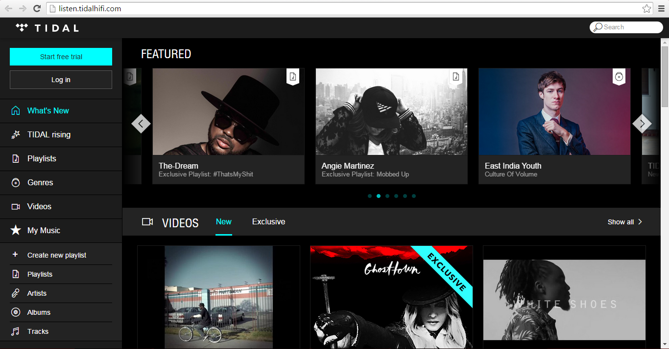
Like Spotify, the color scheme mostly sticks to dark grays and blacks that put the content front and center; describing their first impressions, testers noted the very dark background, calling it “chill” and “suitable for a lot of different moods” – appropriate for a music platform.
Subtle differences in Tidal’s color scheme, however, communicate a slightly different message from Spotify; the contrasts are sharper, the images brighter, the lines cleaner. Combined with bold turquoise highlights, these choices signal a more refined, slick character that testers interpreted as “modern” and “professional” – an identity in line with the service’s pay-only model and high-quality branding claims.
The videos drew special attention from our testers because of the visual prominence they receive but also because it’s a feature that Spotify doesn’t have. As tester Abraham from LA noted, the emphasis on video is a double-edged sword for Tidal, because while it showcases a unique feature, it also misleads visitors about Tidal’s primary identity – as a music streaming service, not a video hub.
The sidebar menu
Both platforms use a sidebar menu as the primary means of navigation, and in some ways here Tidal’s design outperforms Spotify’s. The Spotify menu is jammed full of too many options, some of them nebulous and relatively unuseful. Meanwhile, the majority of users’ playlists, which constitute the central part of the Spotify user experience, are pushed offscreen for lack of space.
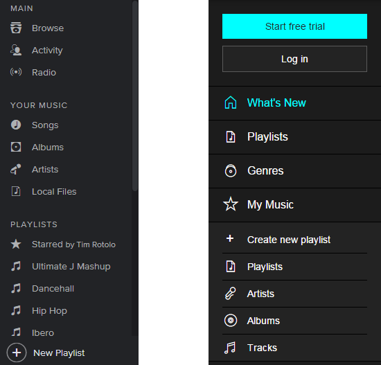
Tidal has kept it simple with their menu options – the sidebar is compact and much less cluttered than Spotify’s. However, there are notable hierarchy issues that inject confusion into what could have been a superior design: the set of menu options below My Music are of slightly different coloration and size, and the reason is not clear.
The visual cues half suggest that they are subcategories of My Music, yet there is a clear separation between the two. They are also indented at the same level as the rest of the links; are they subcategories or not? Additionally, one is called Playlists, the same as another link further up on the sidebar, and the difference between the two is entirely unclear.
All in all, Tidal does a relatively good job of presenting a main page that is unique but still holds to the UX conventions users will recognize and understand. The younger platform had an opportunity to one-up Spotify’s design with a cleaner menu but squandered it with poorly communicated hierarchy.
Tidal isn’t necessarily worse than Spotify, but ties go to the established player, never the upstart.
Spotify: 1, Tidal: 0.
Task 2: Find a favorite artist
Tidal runs into usability problems pretty quickly on this task, because half of the testers never even noticed the search bar, tucked away in the top right corner. One tried clicking the Artists link on the sidebar, which in fact is for saved artists. Another assumed that the only way to get to an artist page was through tracks shown in playlists.
Spotify‘s search bar is more visible above the sidebar, where users are likelier to see it, and it is also larger. Both platforms have issues with their search results, though. Each gives results for several distinct categories, including artists, albums, playlists, and tracks; the artist and album results for both are filled with redundant or irrelevant entries, and album results don’t filter out singles.

But Spotify at least makes these poor-quality results secondary, leaving the focus on song listings. Tidal uses up much more space to display these categories, which may have been a conscious decision since user activity tends to center on playlists over single tracks. If so, they should have committed fully to such a re-conceptualization, and put playlist results first; on Tidal these are more interesting and better-quality anyways.
Tidal’s song results are abysmal, failing to take relevance and popularity into account. The first 14 tracks returned for keyword Beyonce, for example, are songs literally entitled Beyonce, none of which are by the singer herself.
Tidal once again fails to capitalize on an opportunity for improving on Spotify’s model, and definitively loses this round.
Spotify: 2, Tidal: 0.
Task 3: Listen to a few tracks by your chosen artist
Tidal falls further behind with some signalling missteps on its song listings.
Each track entry shows the title, the artist name, and the album, all of which become underlined when users hover over them. This is a pretty standard signal that the underlined words are a link, and the artist and album name do indeed link to artist and album pages. The song title, however, just plays the song when clicked, which is of course what it ought to do; but it should not appear as a link to users. Visual cues should be consistent across any site or app.
![]()
As Steve Krug’s famous UX maxim goes: Don’t make me think. Users should never have to wonder how an element will behave, or what the outcome of interacting with it will be. One user was left believing that the only way to play songs on Tidal was through the Play Now option listed under More Options at the far right.
Another misleading element is the Play button which appears to the left of the track titles (on some, but not all, pages – another mistake). Pressing it for the first time plays the song; when pressed a second time, it does not pause the song, as testers expected it to, but instead starts playing it again from the beginning.
Lastly, the Add to Playlist icon at the right of the track listing (between the Favorite star and the More Options dots) is so small and messy as to be unidentifiable without closer inspection. Tidal once again falls short, leaving the score at 3-0, Spotify.
Task 4: Explore the playlists
Playlists are the most commonly used function of streaming services like Spotify. People use playlists to complement their mood, to be a soundtrack to their daily activities, to motivate them while they work out, and often as a means to find new music. They are arguably the most important feature for a music streaming platform, and if Tidal finishes strong on this task it might still nab a tie.
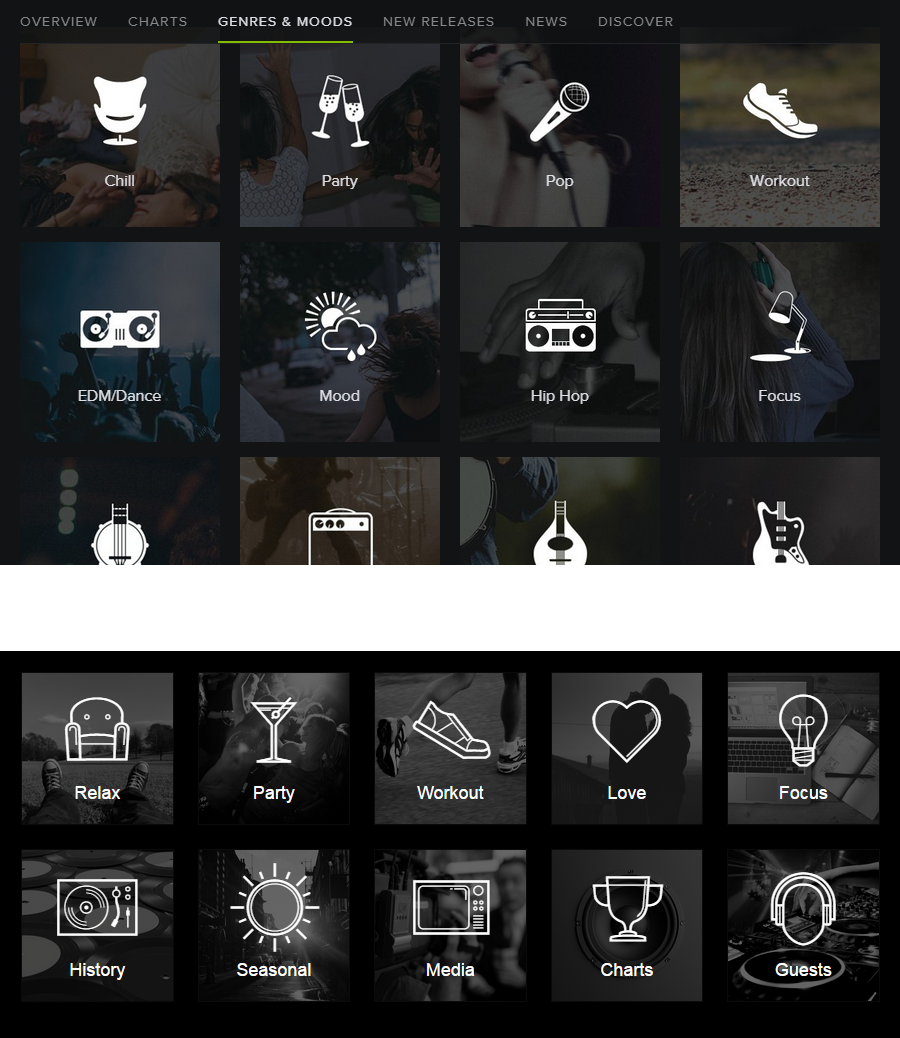
Here again, Tidal chose to replicate almost exactly the layout and style of Spotify for displaying playlists, and like in many other instances, did so with a better use of space.
Tidal also chose to separate mood and theme based playlists from genre based playlists, which Spotify combines; whether this is better for creating a cleaner infrastructure, or worse for adding complexity, could be argued either way. Some testers really liked having a Genres link on the sidebar menu and said they would use it frequently.
While Tidal pitches the quality of its expert-curated playlists as a selling point, as far as usability goes there is nothing that stands out about its design. If Tidal wins this round, it is only by a hair, and certainly not by enough to make up for its deficit from the first 3 tasks.
The challenge for an underdog in any market is to stand out enough to attract users away from the top dogs. Building a superior user experience is one way, but not the only way, to achieve this. However, when the products are as fundamentally similar as Tidal and Spotify, user experience is one of the most significant differentiators.
Thus far, Tidal has not shown an ability to move UX design forward in the music streaming field, even where there is clearly room for improvement.
This month’s UX Wars winner is…
 Read More:
UX Wars May: Expedia vs Priceline
UX Wars March: BeerAdvocate vs RateBeer
UX Wars February: OkCupid vs Match.com


