This post is Part 1 of a 2-part competitive usability study. In Part 1, we deal with how to set up a competitive usability testing study. In Part 2, we showcase results from the study we ran, with insights on how to approach your data and what to look for in a competitive UX study.
There are many good reasons to do competitive usability testing. Watching users try out a competitor’s website or app can show you what their designs are doing well, and where they’re lacking; which features competitors have that users really like; how they display and organize information and options, and how well it works.
A less obvious, but perhaps even more valuable reason, is that competitive usability testing improves the quality of feedback on your own website or app. By giving users something to compare your interface to, it sharpens their critiques and increases their awareness.
Read more: 5 secrets to comparative usability testing
If a user has only experienced your website’s way of doing something, for example, it’s easy for them to take it for granted. As long as they were able to complete what was asked of them, they may have relatively little to say about how it could be improved. But send them to a competitor’s site and have them complete the same tasks, and they’ll almost certainly have a lot more to say about whose way was better, in what ways, and why they liked it more.
Thanks to this effect alone, the feedback you collect about your own designs will be much more useful and insight-dense.
Quantifying the differences
Not only can competitive user testing get you more incisive feedback on what and how users think, it’s also a great opportunity to quantitatively measure the effectiveness of different pages, flows, and features on your site or app, and to quantify users’ attitudes towards them.
Quantitative metrics and hard data provides landmarks of objectivity as you plan your roadmap and make decisions about your designs. They deepen your understanding of user preferences, and strengthen your ability to gauge the efficacy of different design choices.
When doing competitive UX testing – whether between your products and a competitor’s, or between multiple versions of your own products – quantitative metrics are a valuable baseline that provide quick, unambiguous answers and lay the groundwork for a thorough qualitative analysis.

Domino’s vs Pizza Hut: A competitive user testing case study
We revisited our old Domino’s vs Pizza Hut UX faceoff, this time with 20 test participants, to see what we would find – not just about the UX of ordering pizza online, but also about how to run competitive usability tests, and how to use quantitative data in your competitive study.
Why 20 users? It’s the minimum sample size to get statistically reliable quantitative data, as NNGroup and other UX research experts have demonstrated. In our post-test survey, we included a number of new multiple choice, checkbox-style, and slider rating questions to get some statistically sound quantitative data points.
Read more: How many users should I test with?
Setup of the study
The first choice you need to make when setting up a competitive UX study is whether to test each interface with separate groups of users, or send the same users to each one.
As described above, we prefer sending the same users to both if possible, so that they can directly compare their experiences with a sharp and keenly aware eye. We recommend trying this method if it’s feasible for your situation, but there are a few things to consider:
1. Time: How long will it take users to go through both (or all) of the interfaces you’re testing? If the flows aren’t too long and the tasks aren’t too complicated, you can safely fit 2 or even 3 different sites or apps into a single session.
The default session duration for TryMyUI tests is 30 minutes, which we’ve found to be a good upper limit. The longer the session goes, the more your results could degrade due to tester fatigue, so keep this in mind and make sure you’re not asking too much of your participants.
2. Depth: There will necessarily be a trade-off between how many different sites or apps users visit in a single session, and how deeply they interact with each one. If you need users to go into serious depth, it may be better to use separate groups for each different interface.
3. Scale: To get statistically reliable quantitative data, at least 20 users should be reviewing each interface. If every tester tries out both sites during their session, you only need 20 in all. If you use different batches of testers per site, you would need 40 total users to compare two sites.
So if you don’t have the ability or bandwidth to recruit and test with lots of users, you may want to simplify each flow such that they can fit into a single session; but if your team can handle larger numbers, you can have 20 visit each site separately (or even have some users visit multiple sites, and others go deeper into a single one).
For our Domino’s vs Pizza Hut test, we chose to send the same users to both sites so they could directly compare their experience on each. This wasn’t too much of a challenge, as ordering pizza is a relatively simple flow that doesn’t require intense or deep interaction, and the experience of both sites could fit easily into a 30-minute window.
Learn more: user testing better products and user testing new products

Accounting for bias
As with any kind of usability testing, it’s critical to be aware of potential sources of bias in your test setup. In addition to the typical sources, competitive testing can also be biased by the order of the websites.
There’s several ways that this bias can play out: in many cases, users are biased in favor of the first site they use, as this site gets to set their expectations of how things will look and work, and where different options or features might be found. When the user moves on to the next website, they may have a harder time simply because it’s different from the first one.
On the other hand, users may end up finding the second site easier if they had to struggle through a learning curve on the first one. In such cases, the extra effort they put in to understand key functions or concepts on the first site might make it seem harder, while simultaneously giving them a jump-start on understanding the second site.
Lastly, due to simple recency effects, the last interface might be more salient in users’ minds and therefore viewed more favorably (or perhaps just more extremely).
To account for bias, we set up 2 tests: one going from A→B, and one from B→A, with 10 users per flow. This way, both sites would get 20 total pairs of eyes checking them out, but half would see each site first and half of them second.
No matter whether the site order would bias users in favor of the second platform or the first, the 10/10 split would balance these effects out as much as possible.
The other benefit of setting up the study this way is that we would get to observe how brand new visitors and visitors with prior expectations would view and interact with each site. Both Domino’s and Pizza Hut would get their share of open-minded new orderers and judging, sharp-eyed pizza veterans.

Writing the task script
We re-used the same task script from our previous Domino’s vs Pizza Hut test, which has been dissected and explained in an old blog post here. You can read all about how we chose the wording for those tasks in that post.
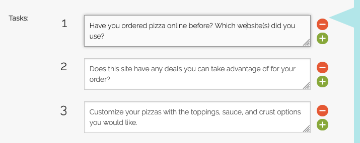
You can do a quick skim of the task list below:
Scenario: You’re having a late night in with a few friends and people are starting to get hungry, so you decide to order a couple of pizzas for delivery.
- Have you ordered pizza online before? Which website(s) did you use?
- Does this site have any deals you can take advantage of for your order?
- Customize your pizzas with the toppings, sauce, and crust options you would like.
- Finalize your order with any other items you want besides your pizzas.
- Go through the checkout until you are asked to enter billing information.
- Please now go to [link to second site] and go through the pizza ordering process there too. Compare your experience as you go.
- Which site was easier to use, and why? Which would you use next time you order pizza online?
We also could have broken down Task 6 into several more discrete steps – for example, mirroring the exact same steps we wrote for the first website. This would have allowed us to collect task usability ratings, time on task, and other user testing metrics that could be compared between the sites.
However, we decided to keep the flow more free-form and let users chart their own course through the second site. You can choose between a looser task script and a more structured one based on the kinds of data you want to collect for your study.

The post-test survey
After users complete the tasks during their video session, we have them respond to a post-test survey. This is where we posed a number of different rating-style and multiple-choice type questions to try and quantify users’ attitudes and determine which site performed better in which areas.
Our post-test survey:
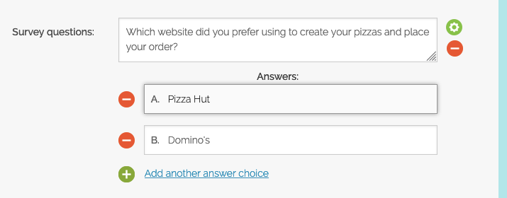
- Which website did you prefer using to create your pizzas and place your order? (multiple choice, single-select)
- Domino’s
- Pizza Hut
After completing both flows and giving feedback on each step, we wanted the users to unequivocally choose one of the websites. This way we could instantly see the final outcome from each of the tests, without trying to parse unemphatic verbal responses from the videos.
For each test, we listed the sites in the order they were experienced, to avoid creating any additional variables between the test.
- How would you rate your experience on the Domino’s website, on a scale of 1 (Hated it!) to 10 (Loved it!)? (slider rating, 1-10)
- How would you rate your experience on the Pizza Hut website, on a scale of 1 (Hated it!) to 10 (Loved it!)? (slider rating, 1-10)
Here again we showed the questions in an order corresponding to the order from the video session. First users rated the site they started on, then they rated the site they finished on.
- In which of the following areas do you feel that PIZZA HUT’S website was BETTER than DOMINO’s, if any? (multiple choice, multi-select)
- Overall mood/feel of the site
- Attractive pictures, images, and illustrations
- Ease of navigating around the site
- Clarity of information provided by the site
- None of the above
For the fourth question, we listed several different aspects of the user experience to see which site held the edge in each. Users could check any number of options, and we also included a “none of the above” option.
In this case, we asked users to select areas in which the second site they had tested was superior to the first. We felt that since users might tend to favor the first site they experienced, it would be most illuminating to see where they felt the second site had been better.
If we were to run this test again, we would include more options to pick from that later came up in our results, such as the availability of appealing promotions/deals, and the choices of pizza toppings and customizations and other food options.
- What is the #1 most important thing about a pizza website, to you? (free response)
Since we knew that we probably wouldn’t think of every possible area of the experience that users cared about, we followed up by asking a free-response question about what users prioritized the most in their online ordering experience. This allowed us to get more insight into the previous question, and build a deeper understanding of each user’s mindset while viewing their videos and other responses.
- On average, about how often do you order pizza for delivery (including online or over the phone)? (multiple choice, single-select)
- Several times a week
- About once a week
- Once or twice a month
- Less than once a month
- Which of the following is your preferred chain to order delivery pizza from? (multiple choice, single-select)
- Domino’s
- Pizza Hut
- Papa John’s
- Little Caesars
- Other
The final 2 questions were just general information-gathering questions. We were interested to see what kind of backgrounds the testers had (and were maybe also a little excited to try out more of the new post-test question types).
Besides expanding the options in question 4, the other thing we would change about the post-test survey if we ran this study again would be to ask more free-response type questions. We found that with so many quantitative type questions, we actually missed out on some qualitative answers that would have been useful (especially in conjunction with the data we did get).
Some example questions we would add, which we thought of after getting the results in, are:
- What did you like the best about the [Domino’s/Pizza Hut] website?
- What did you like the least about the [Domino’s/Pizza Hut] website?
- Do you feel that your experience on the two sites would influence your choice between Domino’s and Pizza Hut if you were going to order online from one of them in the future?
Wrapping up Part 1
Besides the task script and post-test survey, the rest of the setup just consisted of choosing a target demographic – we selected users in the US, ages 18-34, making under $50,000. Once the tests were finalized, we launched them and collected the 20 results in less than a day.
In Part 2 of this series, we’ll go over the results of the study, including the quantitative data we got, the contents of the videos, and what we learned about doing competitive usability testing.


