


This post is a follow-up to an earlier article: A case study in competitive usability testing (Part 1). In Part 1, we dealt with how to set up a competitive usability testing study. Part 2 will showcase results from the study we ran, with insights on how to approach your data and what to look for in a competitive UX study.
Recently, we wrote about setting up a competitive usability study to compare two (or more) interfaces side by side. We recruited 20 users, and had 10 of them try placing a pizza delivery order first through the Domino’s website and then through Pizza Hut; and the other 10 first on Pizza Hut and then Domino’s.
After they had completed their video session, we had each user answer some post-test survey questions, including multiple-choice, slider rating, and free response questions, to better understand and quantify their final opinions.
Read more: How many users should I test with?
As expected, each website performed better on average when users had experienced it first out of the two sites. However, Domino’s still emerged as the overall winner of the comparison, with higher combined scores and a still-strong performance amongst those who had used the site second.
Below, we’ll walk through the survey and video results in detail and describe key insights from the data.
Post-test survey results
Before diving into our video results (6 hours of them!), we started by looking through our post-test survey data to get an idea of the final outcome and main takeaways. That way, we could tackle the videos with a mental framework in place, and save ourselves time and effort.
Read more: Using quantitative data in your UX research
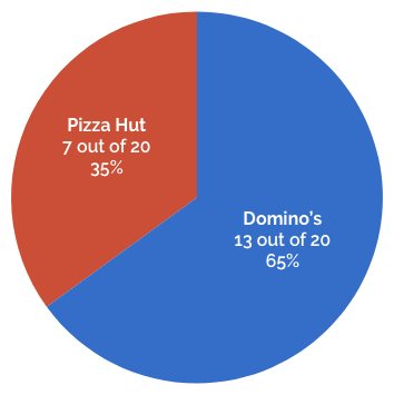
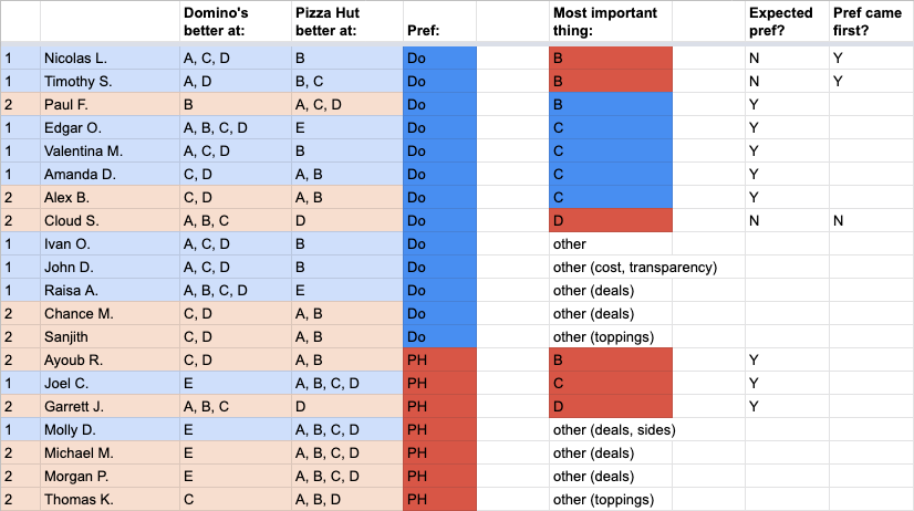
Q1. Which website did you prefer using to create your pizzas and place your order?
In total, 13 out of 20 users (65%) indicated that they preferred the Domino’s website. Among users who visited Domino’s first, 8 out of 10 preferred it. Of those who visited Pizza Hut first and Domino’s second, it was an even split – 5 users chose each site.
We discussed bias and how to control for it in Part 1, and we were expecting each site to do better among users who experienced it first (since the first site gets to set user expectations for where things are and how they work).
Read more: Bias in user testing
It seems that’s exactly what happened. Each website performed better when it came first instead of second – Domino’s getting 8 votes instead of 5, and Pizza Hut getting 5 votes instead of 2.
However, the fact that Domino’s still tied Pizza Hut even when it came second in the flow was an early indicator that it had an objectively better UX.
Q2-3. How would you rate your experience on each website, on a scale of 1 (Hated it!) to 10 (Loved it!)?
The slider rating questions further reinforced the overall performance of the two sites – and the effects of order bias on users’ perceptions.
Domino’s scored higher on average than Pizza Hut whether it came first or second. Not only that, the site also had a higher median and mode in both cases, and a lower standard deviation (indicating a more consistent experience for all users).
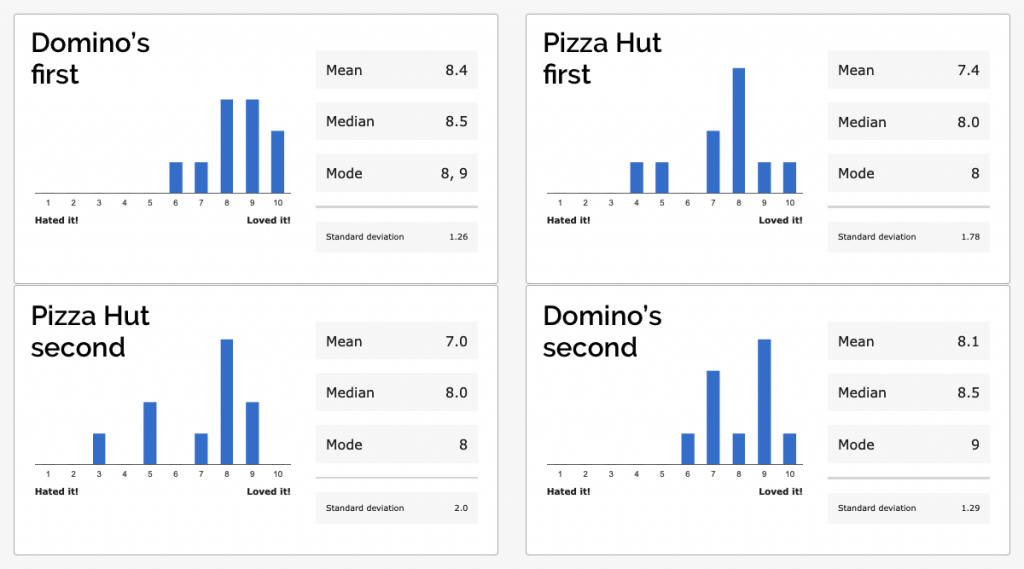
The gap between the sites was smaller when Pizza Hut came first, though: just a 0.7 difference, instead of 1.4 when Domino’s was first.
Q4. In which of the following areas do you feel that [the second company]’s website was BETTER than [the first], if any?
We asked users to indicate whether Domino’s or Pizza Hut was superior in each of the following categories (colors correspond to graphs below):
- Overall mood/feel of the site (blue)
- Attractive pictures, images, and illustrations (red)
- Ease of navigating around the site (yellow)
- Clarity of information provided by the site (green)
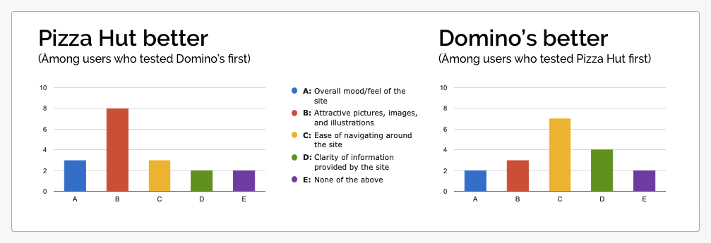
Across both test flows, users favored the first website they visited – out of a total of 40 possible points (10 users x 4 categories) only 16 were given to the second website in either case.
However, among each set of users, one category stood out as a key strength for the second site. Those who used Domino’s first said that Pizza Hut had more “attractive pictures, images, and illustrations” by 8 to 2; those who used Pizza Hut first said that Domino’s had superior “ease of navigating around the site” by 7 to 3.
The most interesting takeaway here is that among Pizza Hut-first users, Domino’s received less total votes across categories (16 out of 40) despite receiving better overall ratings on the slider question, and 50% preference among users.
There are a couple of possible ways to read this:
(A) The one category in which Domino’s received more votes (“ease of navigating”) could have been disproportionately important to users, and impacted the overall standings more than categories like “attractive pictures.”
(B) There may be other ways in which the Domino’s site is superior to Pizza Hut, which were not accounted for by this survey question.
In fact, we felt that there was likely some truth to both of these possibilities. More on that below.
Q5. What is the #1 most important thing about a pizza website, to you?
Knowing that our previous question likely wouldn’t cover all of the different aspects that mattered to users, we asked them this free-response question to dig deeper into their preferences.
Then, we did a direct comparison of the written responses to this question and the responses from Question 4. First, we read through the Q5 responses, and if they matched with one of the four categories from the last question, we assigned it to that category. For answers that didn’t match anything, we assigned a new category.
Learn more: Better eCommerce with SEO
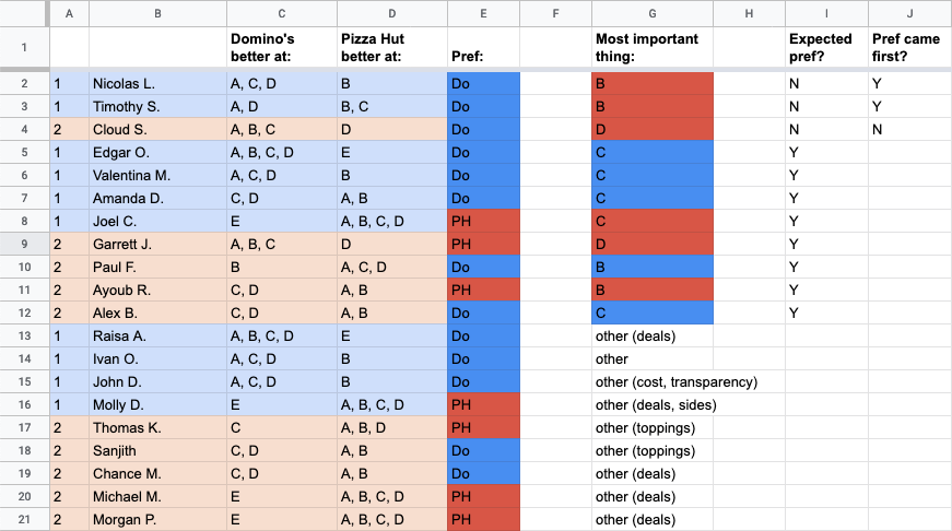
Next, we cross-referenced each user’s most important thing against their selections from Q4, and against their final decision from Q1. For example…
Tester Paul said the most important thing to him was “images and presentation” (we assigned this to the category B, “attractive pictures, images, and illustrations”).
In Q4, Paul voted that Domino’s was superior in that category. In Q1, he had picked Domino’s as his preferred website to use. Therefore, his ultimate preference was consistent with his most important thing.
11 of the 20 users named a “most important thing” that we correlated with one of our pre-defined categories. Out of those 11, 8 users’ final decision was consistent with their Q5 answer. On the other hand…
Tester Timothy said the most important thing to him was “visualization: I’m a visual person and like to see pictures rather than text.” We assigned his answer to the same category as Paul’s.
In Q4, Timothy voted that Pizza Hut was superior in that category. Nonetheless, his preferred website from Q1 was Domino’s, not Pizza Hut.
Why wouldn’t his answer be consistent? We can think of a few explanations:
- People actually aren’t great at knowing what they like and why. While Timothy said that visuals were the most important thing, subconsciously he might have prioritized other aspects instead.
- The cumulative advantages held by Domino’s in other aspects may have outweighed its visual inferiority for Timothy, even if he really did prioritize visuals the most.
- The fact that Timothy experienced the Domino’s website first, and Pizza Hut second, may have subconsciously influenced his preference and led him to favor the first site despite objective considerations.
Of the 3 users whose most important thing contradicted their final decision, 2 of them had visited their preferred website first in the flow.
As for the other “most important things” that didn’t correspond with any of our four categories? Deals/cost was the most popular, accounting for 6 users. Half of them chose Domino’s, half chose Pizza Hut.
Some final thoughts on the data so far:
At this point, can we categorically identify the most important factors affecting users’ ultimate preference between the two websites? Aside from what users said they valued, which of the categories actually showed the strongest correlation with users’ final choices?
Among the 13 users who chose Domino’s, the most commonly cited areas of advantage were C (“Ease of navigating around the site”) and D (“Clarity of information provided by the site”) – both chosen by 11 of the 13. Options A and D, by comparison, were picked by only 8 and 4 of these users, respectively.
Among the 7 users who chose Domino’s, no option stood out as having an especially strong correlation (6 votes for A, 6 for B, 4 for C, and 6 for D). We can at least tell, though, that the weakest link was the “ease of navigating around the site.”
Summary: ease of navigation and clarity of information closely correlated with the strong performance by Domino’s, while navigation was a weakness for Pizza Hut.
Findings from the video results
Having analyzed our post-test survey data, we moved on to watching the user videos. Rather than watching all 6 hours beginning to end, though, we had a plan.
In each video, we jumped right to the final task, Task 7 (“Which site was easier to use, and why? Which would you use next time you order pizza online?”) and watched it. We listened to each user explain their final preference and the key factors that influenced their decision.
Then, in many cases, we jumped to the task(s) in their video that were directly relevant to their feedback, or any other parts we felt would be especially insightful (the SEQ and task completion rates are great features for identifying these).
As we watched our user videos, we noticed patterns in the things users commented on and the things they liked about each site. It also became clear that noticeably more of these patterns favored Domino’s and not Pizza Hut.
What do I get with my coupon?
The most impactful difference between the two experiences was related to how users tracked the fulfillment of their deal coupon.
Both sites offered deals combining pizzas of various sizes and toppings and other menu items, but only Domino’s actually helped users keep track of the different items as they added them to their order, and figure out when all of the parts of the coupon had been checked off.
![]()
As one user put it, “It’s a multi-faceted deal, so they’re walking you through it. That’s what Domino’s did… [W]ith Pizza Hut, you’re just kinda guessing things. I went back and clicked on that deal 4 times to try to add what I wanted… I’m still really confused about what I was buying and I don’t even know if my deal was applied.”
Another user noted that he chose a coupon on Pizza Hut and created his first pizza, but then the site took him directly to his cart – even though the coupon he had clicked wasn’t fulfilled yet:
“When i went to the Domino’s site, it was keeping track of the deal as it went on. It made sure that it was telling me where the deal was fulfilled and how many items I’ve added so far, that are in accordance with the deal. And this one [Pizza Hut], I try fulfilling this deal, and I order the one pizza…..”
Other frequent patterns that cropped up:
- Domino’s consolidated the checkout step into a single page, while Pizza Hut split it into several screens. Most users strongly preferred the single-page version, where they could see all the details at once.
- Domino’s made it easy to toggle through their whole menu, so users could easily view all of their sides, desserts, and other items. On Pizza Hut it was much more difficult to jump between menu categories.
- Domino’s had better deals that several users said were a better match for combinations they actually wanted to order.
But not every pattern was in favor of Domino’s. Here are some other common pieces of feedback that were better for Pizza Hut:
- Pizza Hut had more attractive visual presentation, with a modern style and nicer pictures. “The Domino’s site kinda looks boxy and old and not fun to look at,” said one user. Many users voiced similar sentiments.
- Pizza Hut provided much more information about the toppings and ingredients going onto the pizzas. “They told me what the options actually are. Whereas with Domino’s, when I was creating my pizza they didn’t tell me what the things were, like I didn’t know what the ‘hearty sauce’ was. On the Pizza Hut website it all came with nice fancy descriptors…it described the food better.”
Going back to our post-test survey data, what does all this mean?
1. The comparative advantages for Domino’s that we saw in the videos align pretty clearly with the two survey categories closely correlated with its success: ease of navigation (C), and clarity of information (D).
The coupon tracker falls under both categories, providing the users with clear information about what they needed to do (D) and guiding them through the steps to accomplish it (C).
Putting the checkout on a single page also relates to both; it simplifies the number of steps users need to take to finish (C) and allows them to easily access all information about their order (D).
Easy navigation around the menu is mostly C, but it also makes it easier for users to gather information about the different menu options.
2. Pizza Hut’s favorable feedback correlated with (B) attractive visuals and (D) clarity of information. Clearly, though, the usefulness of the information provided across the rest of the Domino’s site outweighed Pizza Hut’s informational advantage in the create-a-pizza step.
So, what did we learn about running competitive usability studies from these results?
The order of the websites does matter to the outcome of the study. In this case, it clearly caused users to favor the first one they tried (though this won’t always be the case).
Testing both orders with an equal number of users not only helps to nullify these order biases, but it also allows you to cross-reference the data points you collect and analyze the relative performance of the the two sites at a much deeper level, as we did above.
We also saw how quantitative data can be leveraged to build an understanding of what the videos contain, and then execute a highly targeted viewing of the videos that saves time and enhances that understanding.
Of course, you don’t have to go through all the steps we did above. You could just do some simple A/B testing! The primary aim of this exercise has been to put competitive usability testing under the microscope and see what’s possible with such a study. What’s the difference between A/B testing and usability testing? But we hope that this series has inspired you to think about new ways to collect and analyze quantitative data in your user testing, and encouraged you to try testing your own products against a competitor or two.
Got a question about our research methods, or about how to set up your own study? Leave your message in the comments below!
Or, get started with your own UX research right now by signing up for a free trial »
You may be interested in: