


Understanding the fundamentals of design is critical to meeting the customer’s needs and creating an efficient user interface. The Gestalt Principles are some of the most important pieces of knowledge for any designer. They have real impacts on how the user interprets information. This article will define the Gestalt Principles and analyze how they’re impactful for UX and UI.
What are the Gestalt Principles?
The Gestalt Principles are rules of perception that outline how people unconsciously identify and analyze patterns in design. Designers utilize these principles to create connections within products, organize their content, and build friendly experiences for customers.
The Gestalt Principles are 6 individual laws. These are Good Figure, Proximity, Similarity, Continuation, Closure, and Symmetry. These six are not the only Gestalt Principles that exist but are the main ones that any designer should know.
UX design requires attention to detail and a strong understanding of user behaviors. The Gestalt Principles allow designers to create strong experiences with the user in mind. As aa result, the Gestalt Principles are highly applicable in UX design. When used properly, they can guide users to their correct destination, clarify differences at a glance, and create a straightforward and usable interface. Additionally, the Gestalt Principles can help expose customer needs and understand ways to address them positively.
Different Gestalt Principles & their importance to UX
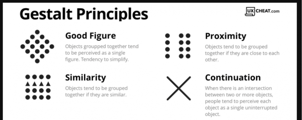
Good figure
The law of good figure applies to elements in the foreground and background and how people interpret their importance due to their alignment.
Good figure is commonly demonstrated with items in negative space or elements that display multiple images depending on their alignment. This is really important for UX regarding buttons, commands, and pop-ups. If a pop-up looks to be on the same plane as the rest of the page, it might look confusing. When it appears in the front of the page, however, it denotes importance and priority.

Proximity
Items are assumed to be related when they are in close proximity.
Proximity plays an important role in UX and is important when it comes to small details. The customer might not know why something looks off or disconnected, but it might be that the text or image isn’t in close enough proximity to its related component.
When analyzing proximity, ask yourself if every single relation is clear at a glance. This helps determine if you grouped items correctly in the eyes of the user.
Continuation
The law of continuation assumes that people will naturally follow items in a smooth line regardless of if they are meant to flow together.
This is a valuable principle for UX because it implies how users will follow a flow of information. It can be confusing from a user’s perspective if the flow of a page isn’t crystal clear, and as the law of continuation states, they might be attracted in a different direction if there is a more natural flow. Looking at continuation can be a good way to test usability because it shows if users assume something different than the intention of the product.

Similarity
Design elements tend to be grouped if they share a similar trait, whether it be color, shape, or location.
The similarity principle can be used effectively to convey relations when things aren’t right next to each other, or there are a lot of items and they need to be grouped visually. Groups form subconsciously based on the traits above, so consider what features similar items should share.
Closure
Items or shapes that are visually incomplete will subconsciously be filled in or constructed as a whole.
This design principle, similar to “good figure,” applies heavily to negative space and assumptions made by users. In its simplest, users construct shapes that seem incomplete or finish without visual closure.
On a deeper level, closure applies effectively to logos and designs that utilize negative space to portray an image. Take the below logo, for example. It uses the principle of closure to show two different images, a person swinging a golf club and a spartan helmet. You use this incredibly nuanced principle to great effect in logos, web design, and UI design.
![]()
Symmetry
The design principle of symmetry shows that people will assume the most straightforward organization of ambiguous shapes.
Symmetry is similar to the principle of continuity, where people assume the simplest version of a shape or line when it isn’t apparent what the complete image looks like. Below is a valuable example of the symmetry principle. We assume the three shapes overlap and align with each other in the simplest way, even when we can’t see the actual outline.

Conclusion
Understanding the Gestalt Principles is an important way that UX designers can use underlying assumptions about negative space, alignment, and symmetry to influence the user experience positively.
Comparative usability testing: Why it matters for your business
