We previously covered how to set up your first usability test with TryMyUI, so now we are going to analyze the test results! We’ve already made a video analyzing the results of one of our UX Wars, so check that out too!
Before we begin, make sure that you are logged-in to your TryMyUI account, or just start a free trial! It’s 14-days of our Enterprise features, as well as 5 free tester videos! Even if you haven’t created or launched a test yet, we include a sample test that you can use to reference.
Let’s get started!

Within a few hours of launching your test, you will receive notifications via email that your usability study is complete. Upon returning to the test, you’ll notice right away that the number of requested and completed testers has been updated.
For future reference, if you ever need to reach out to support, you will need the Test ID number listed in the left card. Otherwise, this card serves as a quick overview of how you set up the test.
Do more with TryMyUI: Get your GUI Going!
The quantitative data
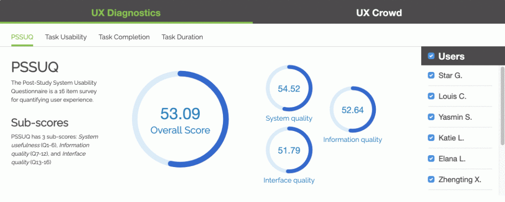
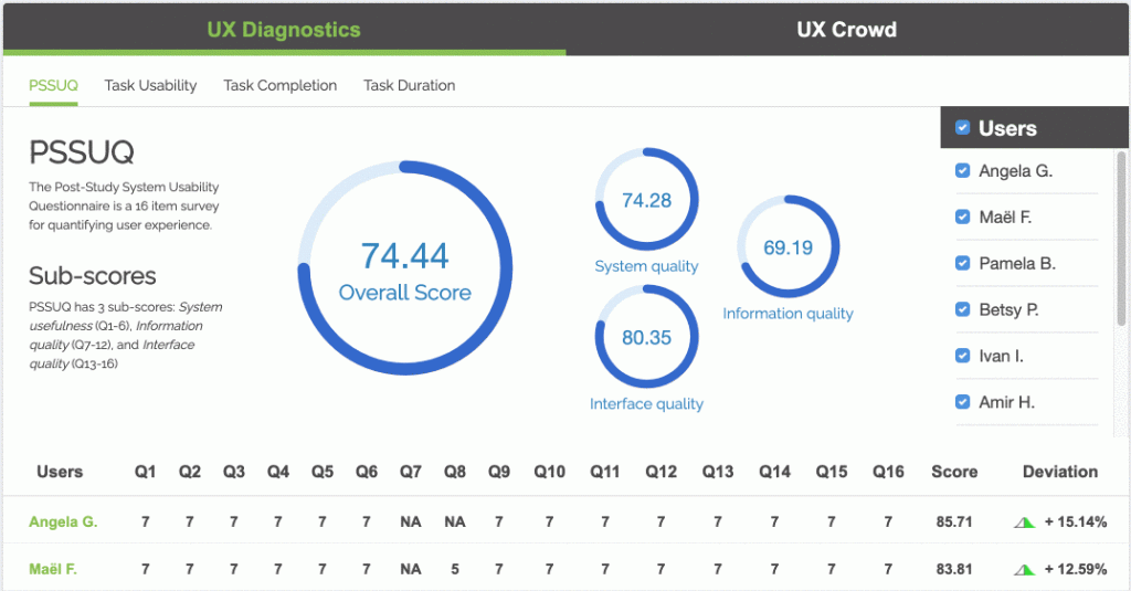
The amount of nitty gritty quantitative data is one of our customers’ favorite aspects of TryMyUI. TryMyUI’s UX Diagnostics panel displays all the quantitative data you selected during the test creation. The main display (above) features your selected psychometric, its sub-scores, and then the list of selectable users to the right.
Our intuitive graphs and charts are easy to read, easy to share, and update in real-time as you select and deselect your test participants. It’s the fun sort of UX research data!

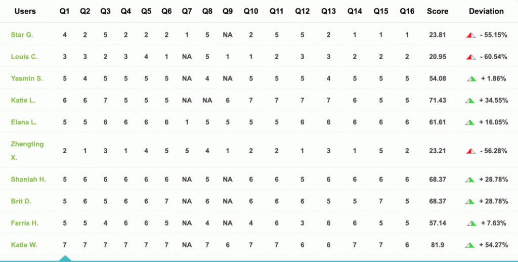
Beneath the psychometric graphs is an expanded list of the users, how they responded to the psychometric survey questions, and their score and deviation. A helpful tip is to check this list first and find out who had the WORST experience. Start with the most extreme deviation.
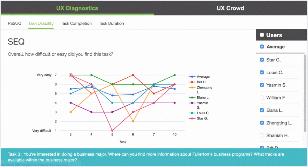
Beyond just the psychometric scoring, you will also find the Task Usability (via the SEQ), Task Completion, and Task Duration user testing metrics tabbed in this panel. The list of users remains, and each separate section allows users to be selected and deselected as you wish. The task usability and task completion sections include an average of the results as well.
All sections include the individual task performance and what the task was (displayed in the blue bar at the bottom).
Along with the UX Diagnostics is the UX Crowd, tabbed in the same card to the right. This TryMyUI-exclusive feature is a crowd-sourced word cloud that testers submit ideas to, and then vote on other opinions. These sentiments are broken into positive (green) feedback, negative (red) feedback, and neutral suggestions.
The number of votes appears in the top-right of the boxes while displayed in the Crowd Cloud. Additionally, you can view a list of the feedback instead of the cloud via the Cloud Details tab.
Understanding the industry:
The qualitative data
Below the quantitative data card is the qualitative card, featuring the Test Videos and Post-test Survey. The test videos tab displays the list of users, along with the ability to play, download, and share their videos. Further to the right is the tester Rating. We pride ourselves on providing high-quality testers, and that is maintained in part by customer ratings.
Note: If your result is subpar, simply rate it a 1 or 2, we’ll review it, and then restore an extra credit to your account!
Some of the collaborative elements, such as Notes and Tags, for each user video are displayed to the far right of the card.
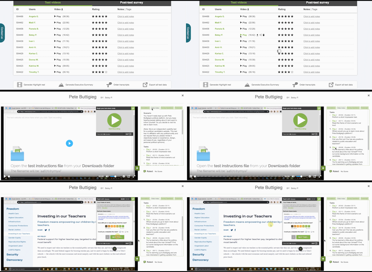
Obviously, the big takeaways and “aha!” moments will most likely come from the user videos themselves. Clicking “Play” on a user will open their video. The video player includes time-stamped annotations, tasks, that user’s unique survey responses, and the transcript (if ordered).
Note that you can access user videos from the quantitative section as well! Check this brief guide on how to streamline your test analysis via video indexing!
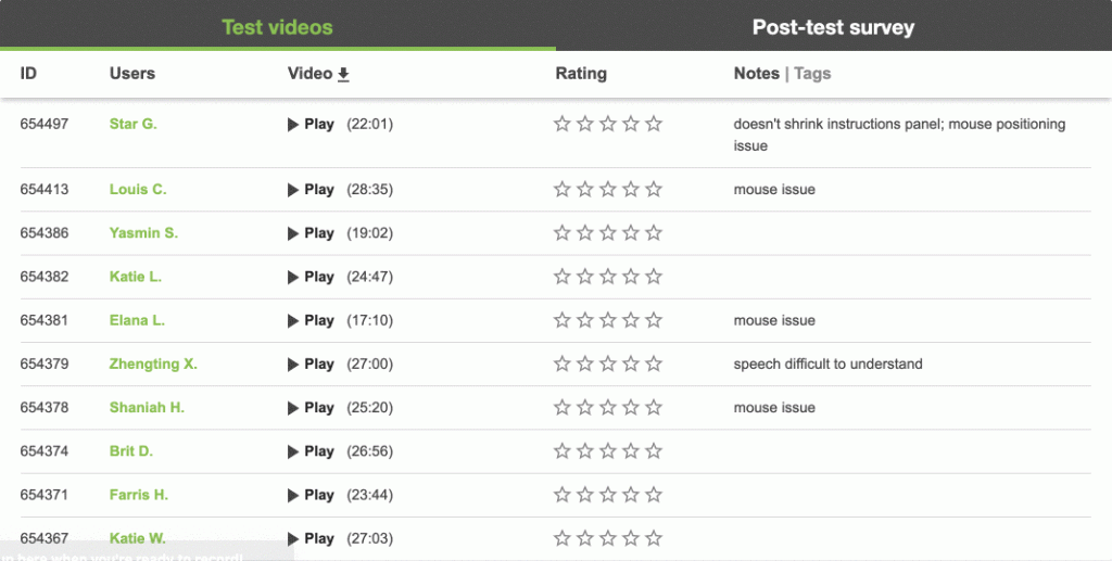
Back to the card itself, the Post-test Survey tab lists the survey questions that you wrote during the test creation process. Organized in a series of drop-downs labeled as the question with the type of question in parenthetical, simple click the question you want to review. Each user response is attached to their name.
Notice the single-select multiple choice survey question is a pie graph, but still lists each user’s response in scroll window to the left.
Extra Features
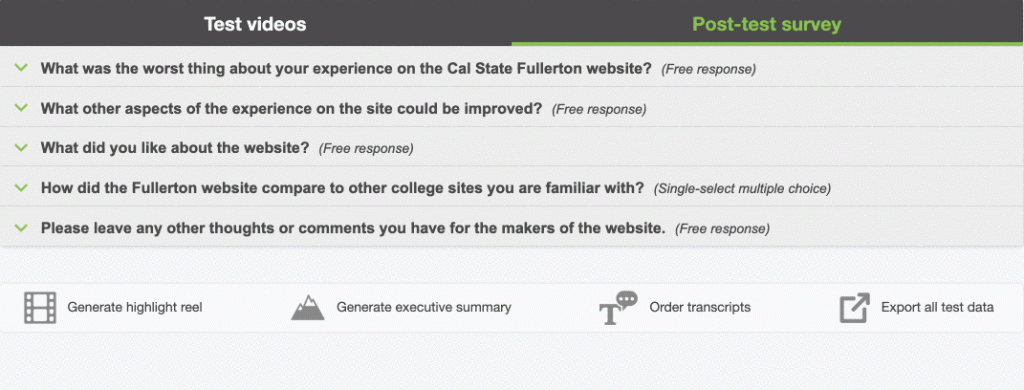
Finally, at the bottom of the page, you will find options to generate a highlight reel, generate an executive summary, order transcripts, or export all test data into a spreadsheet.
Check your plan’s features to see which are available to you!
Happy Testing!
LEARN MORE:


