


What does data-driven design look like in action?
We worked with the conversion rate optimization experts at PayBoard to improve a niche e-commerce website called Crown Bees, an information and supplies provider for amateur beekeepers. With a combination of quantitative visitor metrics gathering and qualitative usability testing, we identified some critical ways in which the site could perform better.
How do these types of data work together?
Visitor flow and conversion metrics help you identify your strong points and weak points. Which pages of your site are the all-stars? Are there particular flows between pages that lead to higher conversions? Observations like this allow you to re-organize your website to route people to the highest performing pages, guiding them into flows and actions that meet your goals.
User testing results, on the other hand, expose the ‘why’ – why your weaker pages aren’t performing, why users don’t understand the message you’re trying to send, why they’re running into obstacles. This kind of knowledge helps you to make necessary fixes by showing you exactly what’s wrong with the way user experience on your site.
Applying the process to Crown Bees
When we took a look at the visitor data for Crown Bees, one fact in particular stood out. Below is a graph of pages on the Crown Bees site, with conversion rate on the y-axis and number of visitors on the x-axis:
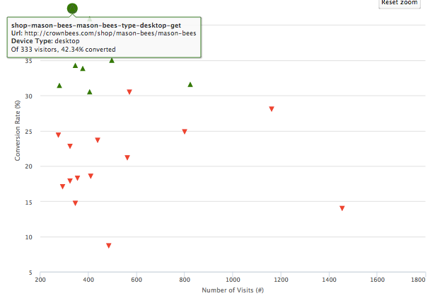
The mason bees shopping page, where visitors can place an order for a colony of mason bees, has an impressive conversion rate of 42%. People love mason bees, it seems.
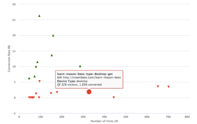
Yet as this graph shows, the learn mason bees page produces very few conversions. Of the people who come to this informational page about mason bees, only 1.83% eventually convert. So do people love mason bees, or hate them? Why is the interest in these bees not translating into transactions?
Taking the deep dive with usability testing
We set up some user tests to explore what was going wrong. Our demographic profile was people who had experience growing their own fruits and vegetables at home.
We asked testers first to learn a bit more about small-scale beekeeping and see whether it was something they could or would do. We asked them to figure out what kind of bees were suitable for their garden, what other supplies they would need, and then finally to purchase all of it.
What we observed was that a lot of people, not knowing much about beekeeping, were drawn to the “Getting Started” page, listed right after “Home” on the menu bar.
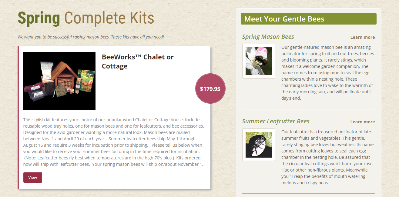
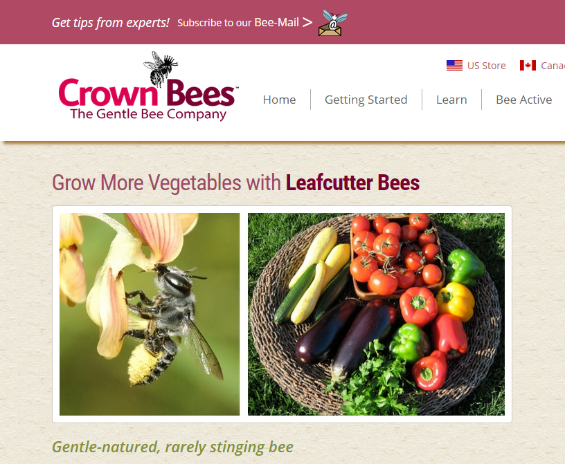
This page shows beekeeping kits on the left hand side, and profiles different kinds of bees on the right. What we observed was that from this page, many users would follow the “Learn more” links by the bees off of this page, landing on, for example, the low-performing learn mason bees page.
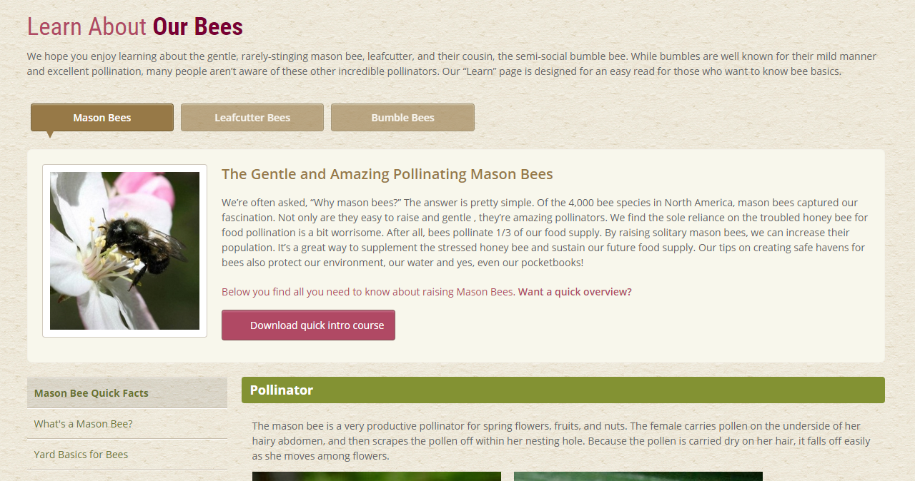
The learning pages are informational and extensive, and users can read about their habits and characteristics, how to care for them, and anything else they need to know.
The problem is that the page is a navigational dead end. At this point users are interested in the bees, and probably feel confident that they could raise bees. But there is no pathway directing users to a shopping page where they can order bees and supplies.
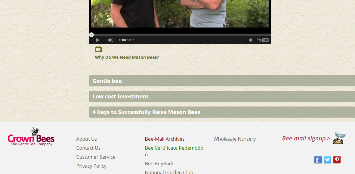
Some users thought “Low cost investment” would help them buy the bees or at least give a sense of the prices, but the section doesn’t offer any purchasing opportunities. Even the footer doesn’t have a shop link for when users have reached the end of the page.
What the site fails to do is create a funnel to enable interested visitors to take the next logical step and go to place an order. The momentum of the user journey is broken.
This insight and others, which Crown Bees can now use to design a more effective website that meets users’ needs and their own goals better, was possible only with data, both qualitative and quantitative.
This is what data-driven design looks like: making informed, strategic design decisions based on demonstrated evidence of how the site works, how it fails, and why.
You may be interested in:
What do you think decides a good user experience? We asked some Google users