St. Patrick’s Day is a time to celebrate the many contributions of Irish Americans… and to drink lots of beer. To help you pick your pints this 17th, we pitted two of the most popular beer rating apps against each other in a usability faceoff. After a few tests with some real-life beer drinkers, here’s what we found…
Task 1: What are the world’s best 3 beers, according to the ratings?
Off to a rocky start…
These two apps could hardly have taken a more different approach to their first screen.
BeerAdvocate’s is a login page – no beer browsing until you’ve created an account. Even worse, the signup pages are not optimized for mobile devices (hello, tiny text fields) and thus BeerAdvocate’s chances at making a good first impression vanish.
RateBeer, on the other hand, opens directly to the main menu; signup is never necessary except to post beer reviews of your own (though it should be noted that their registration process is also not optimized for mobile). The main menu is cleanly designed with a set of basic navigational options arranged with plenty of white space.
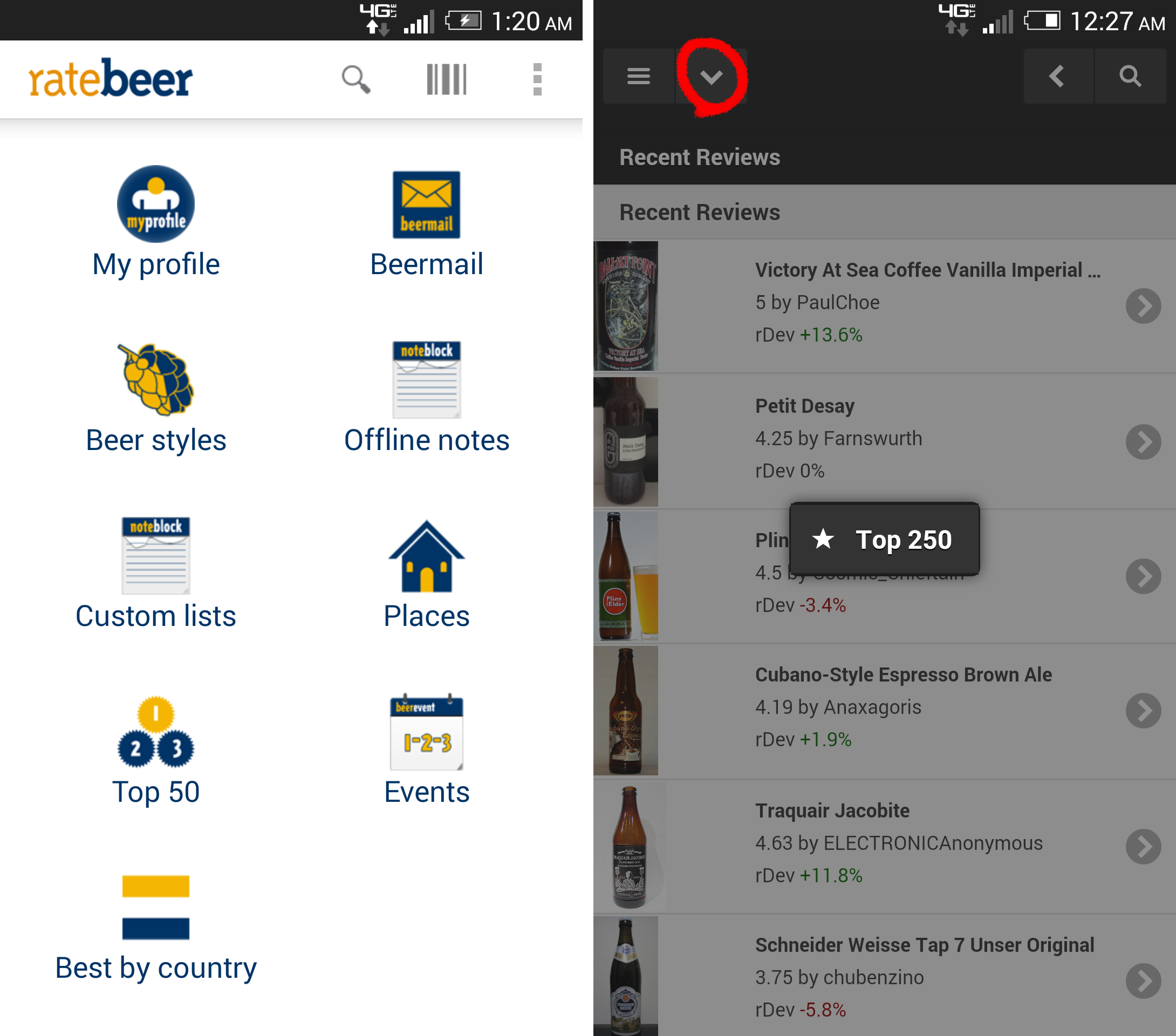
RateBeer‘s menu organization admittedly lacks logic, and its icon choices are not always obvious. But its advantage is visibility: the app’s navigational pathways are clearly presented and labeled, and to complete the first task it is easy to see that the user should choose “Top 50”.
To find the world’s best beers on BeerAdvocate, though, users must open the hamburger menu, select the “Beers” tab, then choose (by guesswork, apparently) to tap the unlabelled down arrow that appears at the top of the screen to open a hovering link to the “Top 250”.
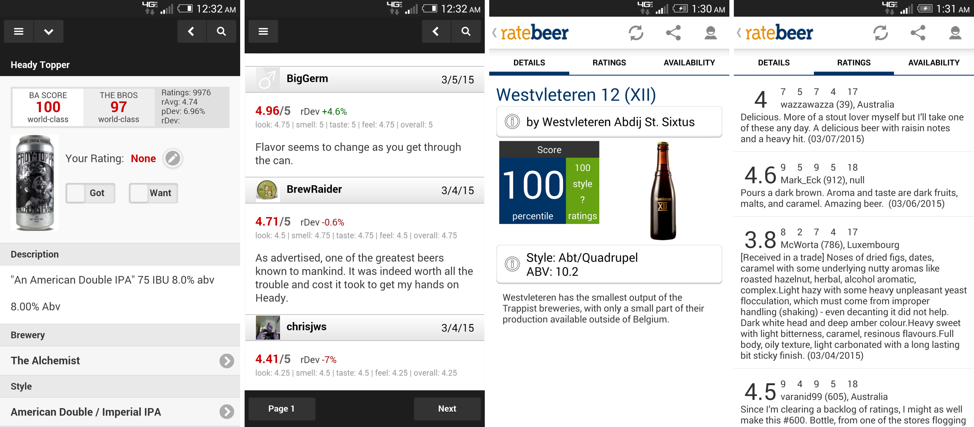
Viewing the beers: Both apps have a decent interface for viewing the beers on the list, but there are missteps on each. BeerAdvocate shows a second, alternate score, called “The Bros”, which is not explained and which testers interpreted in conflicting ways.
RateBeer likewise lists a second, unexplained score for “Style” and in addition fails to report the number of ratings. Taking the confusion a step further, RateBeer shows 5 component scores for each review but fails to label any of them.
RateBeer still wins this round, but loses ground for these glaring errors.
Task 2: You’re a fan of oatmeal stouts; which ones are most worth a try?
RateBeer’s lead holds…
It’s another rough round as both apps struggle with their solution for filtering beer styles.
BeerAdvocate, in the “Styles” tab of its hamburger menu, lists the many beer styles under broad categories – American Ales, Irish Ales, German Ales, German Lagers – 16 in total. This works for users that already have an encyclopedic knowledge of brew types, but many probably don’t know that a Russian Imperial Stout, for example, is actually an English Ale. How many know which of the 16 categories an oatmeal stout falls under? (It’s also an English Ale).
RateBeer takes the other route and shows every single beer style on one enormous list. It’s not searchable either, so finding the style you’re looking for could take quite a bit of scrolling. At least there’s no tapping back and forth between categories.
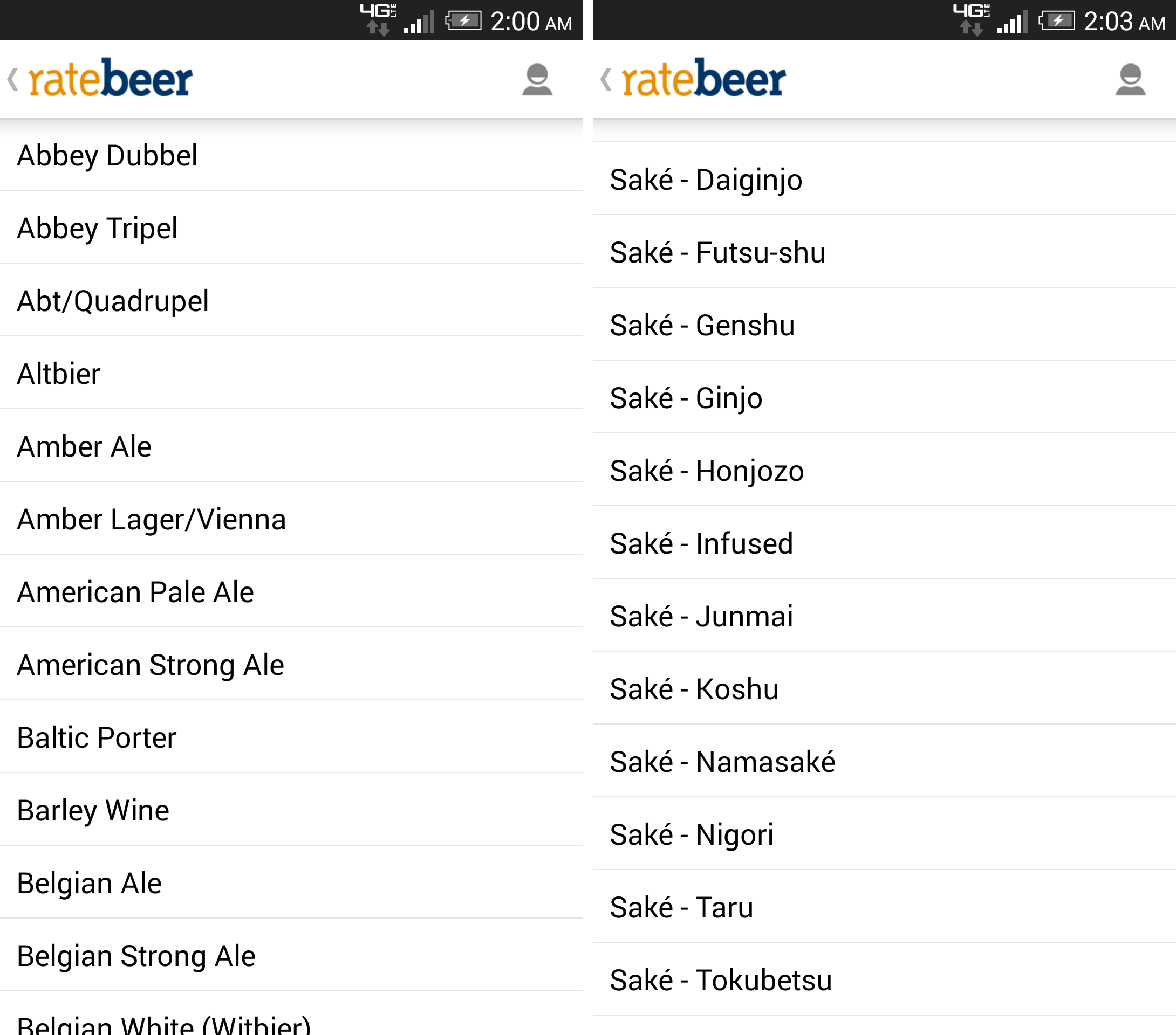
It’s hard to say that either way is better or worse; this one’s too close to call.
Task 3: Go local – what are some of the best beers brewed in your area?
The foot-shooting continues…
Neither BeerAdvocate nor RateBeer allows users to view ranked lists of beers based on place of origin. They do, however, catalog local brewers and beer purveyors using pinned maps.
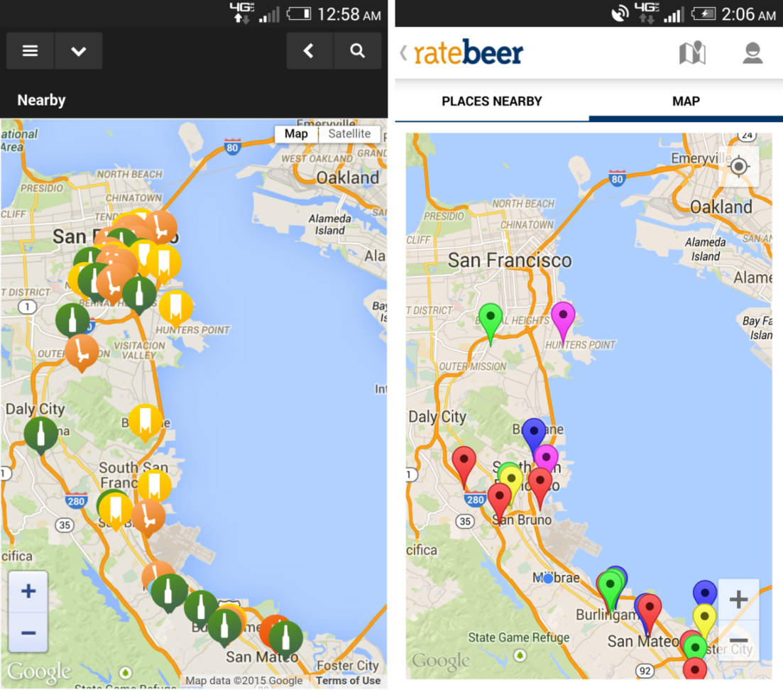
RateBeer’s multi-colored pins prove much less helpful than BeerAdvocate‘s more rememberable pictographic tags, especially considering there’s no key.
Users can also find nearby breweries in a list view, and BeerAdvocate’s mistake is to separate these two functionalities – the map and list can be found, respectively, in the “Nearby” and “Places” tabs of the app’s hamburger menu. RateBeer, on the other hand, sensibly linked the two; the “Places Nearby” tab above the map switches users to a list view.
Unfortunately, neither app’s list allows for filtering, so the only way to view local breweries is intermixed with liquor stores, bars, and restaurants. Once users pick a brewer, their beer lists are not sortable or filterable either, so identifying the highest rated beers is a matter of careful extended scrolling.
RateBeer barely ekes out the lead this round.
Task 4: The Stone IPA is a personal favorite of yours – what rating did it get?
BeerAdvocate finds the gold at the end of the rainbow
This task puts the search function to the test, probably the most important and central function for both apps since it is the primary way by which users will research or rate beers.
That’s why nailing the search function here pushes BeerAdvocate into the lead after a lackluster performance so far. BeerAdvocate’s search does a very good job of returning relevant beers and even updates results as the user types.
RateBeer‘s search is atrocious bordering on unusable. Results are returned in alphabetical order with no regard for relevance or number of ratings, and users must sift through vast amounts of obscure entries with 2-3 ratings to find what they’re looking for.
If the user’s desired beer doesn’t show up on the first page of results (which is limited to a finite number of entries) there’s no way to move on to the next page, so if it happens to fall later in the alphabet there may be no way to locate it with the search function at all.
The Stone IPA, for example, can only be reached through the beers list of the Stone Brewing Company page, or if the user searches “Stone India Pale Ale” and thereby weeds out some of the irrelevant “IPA” results.
Task 5: Submit a rating for a beer you’ve had recently.
Can RateBeer reclaim the lead?
On BeerAdvocate, it’s quite easy to see how to submit your own rating from a beer page. Next to the picture of the bottle are the words “Your Rating”, and when none exists there is a pencil icon that leads the user to the rating interface.
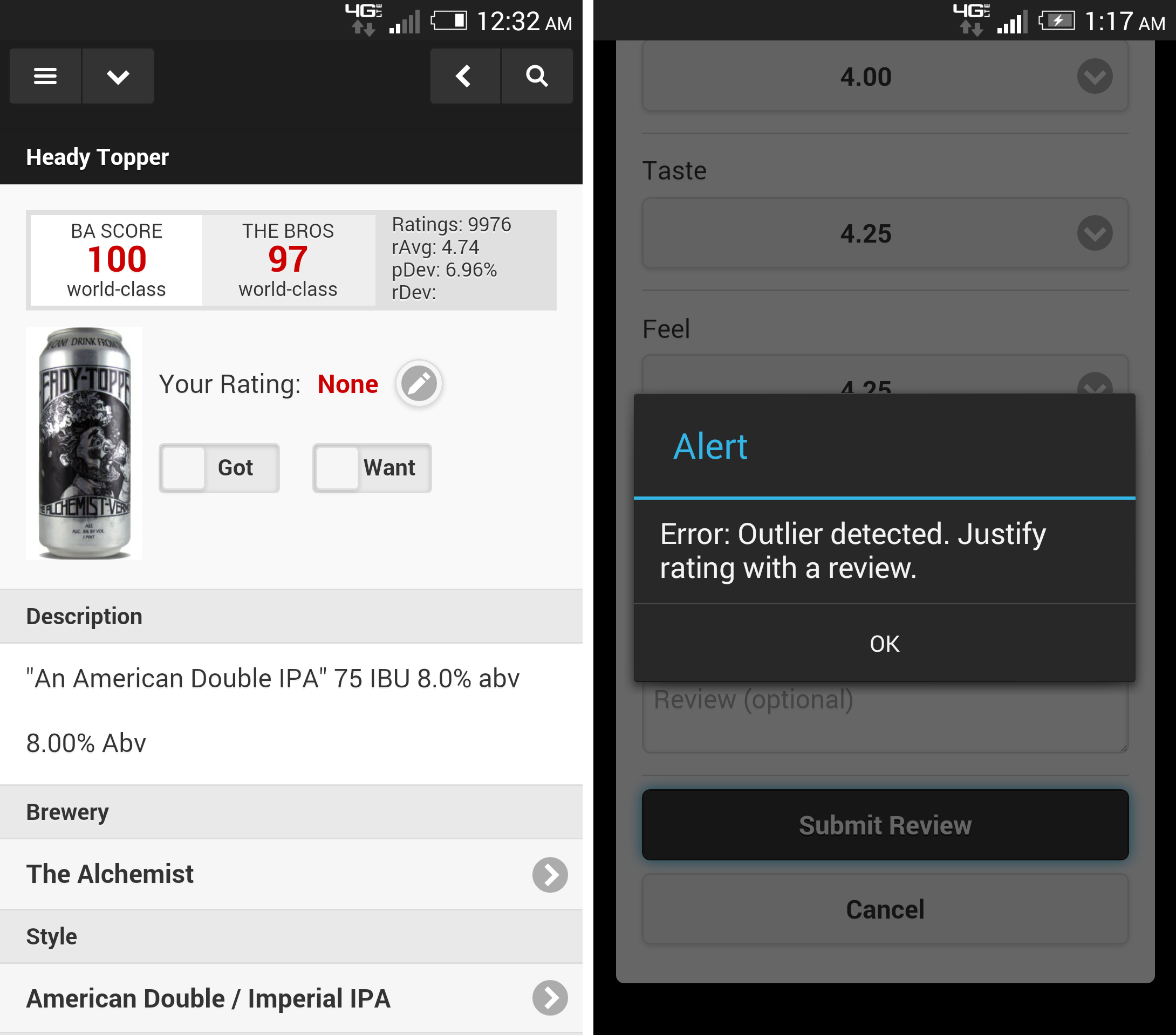
BeerAdvocate allows users to submit their number ratings without a written review, but only if their numbers aren’t outliers – if their voice sticks out from the crowd consensus they’ll be forced unexpectedly to provide justification, and the alert (“Error: Outlier detected”) doesn’t do a great job of explaining why.
Figuring out how to rate a beer can be quite a bit harder on RateBeer, however. The app hides the gateways to submitting a rating when users aren’t signed in, and there’s no message anywhere encouraging them to log in to rate.
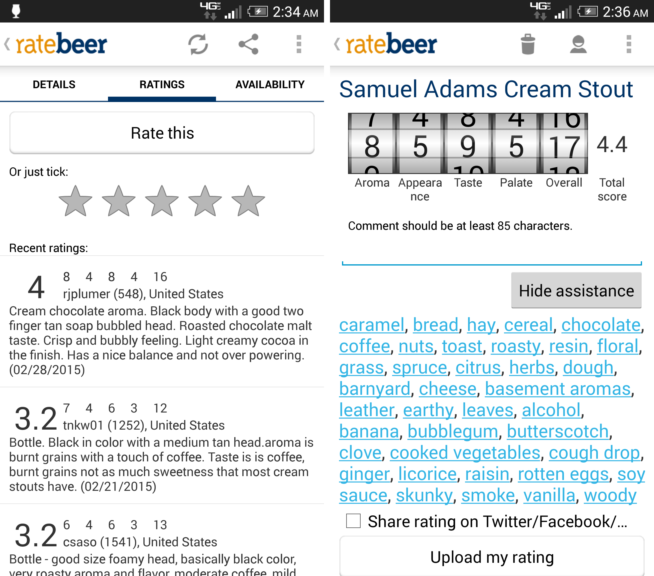
Users are forced to come up with the solution on their own, but if they correctly guess that they’ll need to log in to rate beers, they will in fact find a pretty user-friendly process with scrolling rating bars, a cumulative “Total Score” that responds to changes in input, and lots of word-choice help for writing the review.
While all this is nice, pleasing interactions are ultimately less important than findability, and so RateBeer loses this round and with it, this month’s usability faceoff. Both apps have plenty of room to improve their user experience; each one underwhelms at every turn. In the meantime, throw on some green, grab a Guinness (go for it, they’re rated highly), and start researching your beer lineup.
This month’s UX Wars winner is…
UX Wars May: Expedia vs Priceline
UX Wars April: Spotify vs Tidal
UX Wars February: OkCupid vs Match.com
UX Wars March: Microsoft vs Apple


