Collecting data to inform and improve the user experience design is a never-ending need, for companies from tiny start-ups to large enterprises. There’s much healthy debate on what UX research or usability testing methods should be used, and when.
When it comes to quantitative versus qualitative research, best practices suggest a mix of qualitative and quantitative approaches to capture a holistic perspective. The challenge, however, is how to combine both in a cost-effective, productive way to obtain data to drive user-centered design.
What’s the difference?
The difference between quantitative and qualitative approaches is often explained using contrasting terminology like hard vs soft, numeric vs descriptive, statistics vs insights, measure vs explore, what vs why. These quick contrasts are useful to highlight the strengths and limitations of each approach if used alone without any of the other.

Qualitative tells stories.
At the core of user experience is the subjective, emotion-based response of the individual user – the way a website makes visitors feel. These feelings can range from delighted, impressed, or hooked, to confused, frustrated, and angry. All these welling emotions, and the ones in between, have one thing in common: they won’t show up in the numbers.
Quantitative data can tell you which pages people visited, and how long they stayed, and where they came from and where they went to, but the story itself is missing; the feelings aren’t there.
The user that clicked to your registration page and then left without signing up – what kept them from continuing on? The users staying on the homepage for so long, was it because their interest was captured by great content, or because they were fruitlessly searching around for an About section? When someone clicks to a new page, did they move a step closer to their goal or did they find that they had mistaken the page for something it didn’t provide?
Listening to a user narrate their journey, hearing their reactions as they navigate a site, fills in those blanks. The ups and downs, the irritations and confusions, the aha moments, the satisfaction of a task completed, all come together to tell a story, and the best and worst things about your design stand out like warm bodies through infrared goggles. Qualitative feedback tells “why” at a level that quantitative data cannot reveal.

Quantitative gives context.
Quantitative feedback allows you to understand your site’s usability in the context of a much bigger picture.
Unlike qualitative information, it can be used to make easy, reliable comparisons. User testing tools like SUS (System Usability Scale), the SEQ (Single-Ease Question), and task durations and completion rates that measure and quantify usability can map the individual’s user experience, chart usability increases and decreases over time, and show how your website performs compares to other sites.
For this reason, quantitative data has a unique capacity to persuade. It shows stakeholders and decision-makers what’s working and what’s not, and demonstrates, with numbers, undeniable disparities in performance. That gives it the capacity to strengthen and justify qualitative findings. Then it can be used to set predictable objectives for a new design sprint.

Combining qualitative and quantitative in your research
The challenge with getting quantitative data is that it requires scale for the numbers to mean anything. But user testing is a research method that relies on video data, and video analysis is hard to scale up.
The key is to read between the lines of your quantitative data. Video may not scale well, but if you know how to use all the usability testing data you’ve collected, it’s a lot easier to handle, and can be dissected efficiently even at a large scale.

Data like task duration or task completion are more than just statistics or benchmarks to show higher-ups. Which task took the longest to complete? Which could not be completed? Was it longer than you expected? Look for users whose times/completion scoring stand out from the rest; an unusually long task duration could indicate a user who struggled with the task.
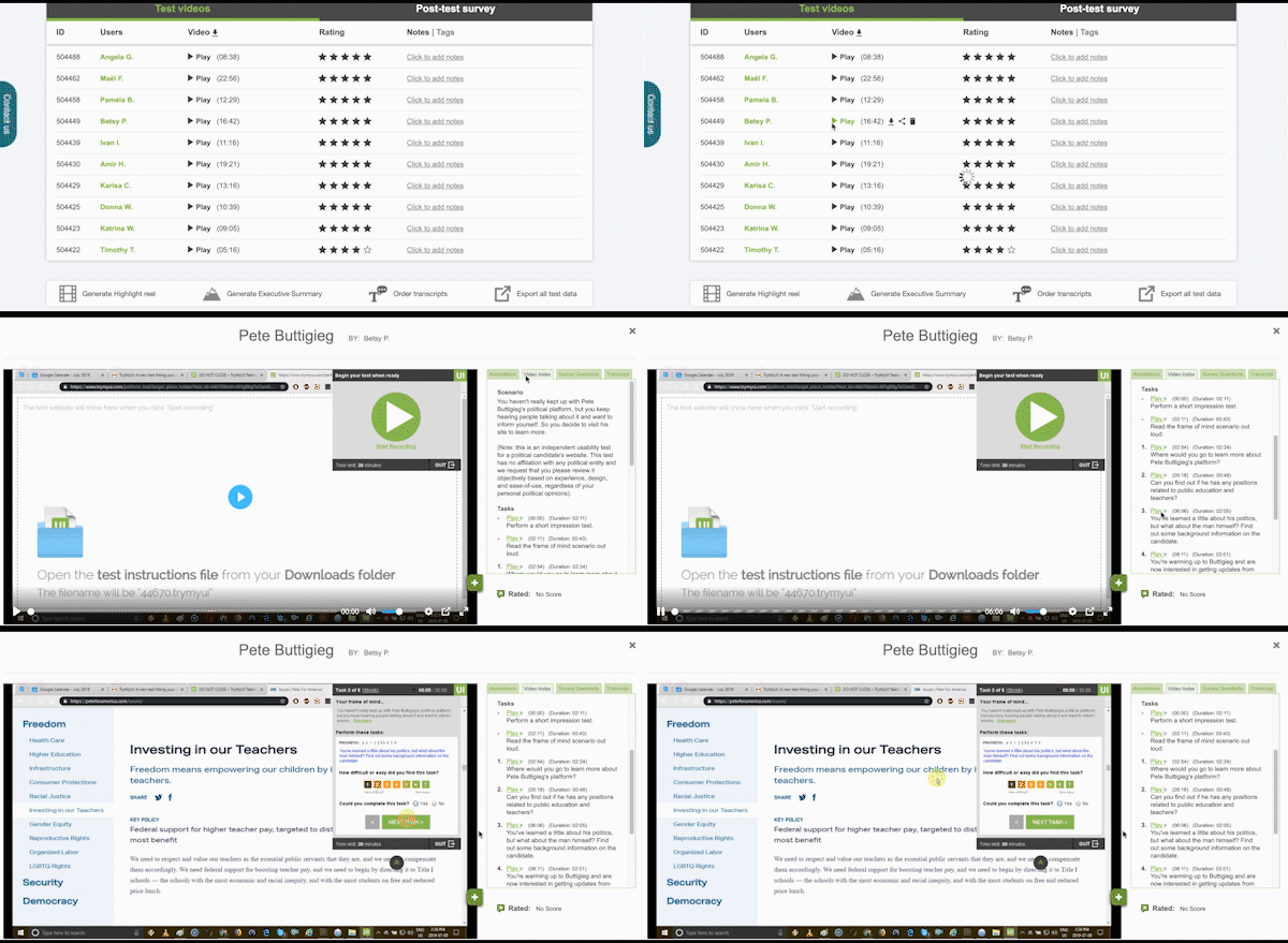
Both of these statistics even provide a shortcut timestamp to launch user videos immediately on the task timestamp so researchers can quickly get to the bottom of what went wrong.
Now you have a starting point to tackle any mass of video data: instead of randomly picking one of your user videos and watching it beginning to end, pick the user that struggled most, and skip to the task they had trouble with.

As you start combining other forms of data you can compile your shortlist of video clips to watch.
Task completion rates and task usability measures like the Single Ease Question (SEQ) help identify the most difficult portions of the experience, and which users found certain tasks difficult or even impossible to finish.
System usability scores like SUS (System Usability Scale) or PSSUQ indicate which users had the worst (and best) overall experience on the site. If you’re going to watch any videos all the way through, these ones will probably be the most useful for your time investment.
UX Crowd, a crowdsourced usability tool, uses voting to show what users liked and disliked about the site. These results can help you identify which parts of the test videos to focus on; you can also compare UX Crowd responses to written survey responses to see what else users had to say about those issues.
Now, having used your quantitative data to create a preliminary framework for analyzing your research, you have a pared-down but highly targeted list of video clips to watch, that may look something like this:
- Users with the best and worst experiences
- Hardest 1-2 tasks from the users with the worst task ratings
- Tasks with unusually long durations from some users
- Tasks containing issues found in UX Crowd
- Users with interesting feedback in the written survey
After working through this much of your data, you can use what you’ve seen so far to make decisions about any additional videos to watch.


