
Why stay up late watching user videos when you could let the crowd do the work?
Usability testing is important, but it can be hard to make time for poring over hours of video data. Can crowdsourcing usability analysis solve this dilemma? This is the question we set out to answer when we built the UX Crowd, a voting-based platform for letting the users themselves identify the most critical issues of a website.
After some modifications to the voting system, we ran a test with 30 users to see if the crowd’s analysis of an apparel website called Serengetee matched up with the site’s real usability issues.
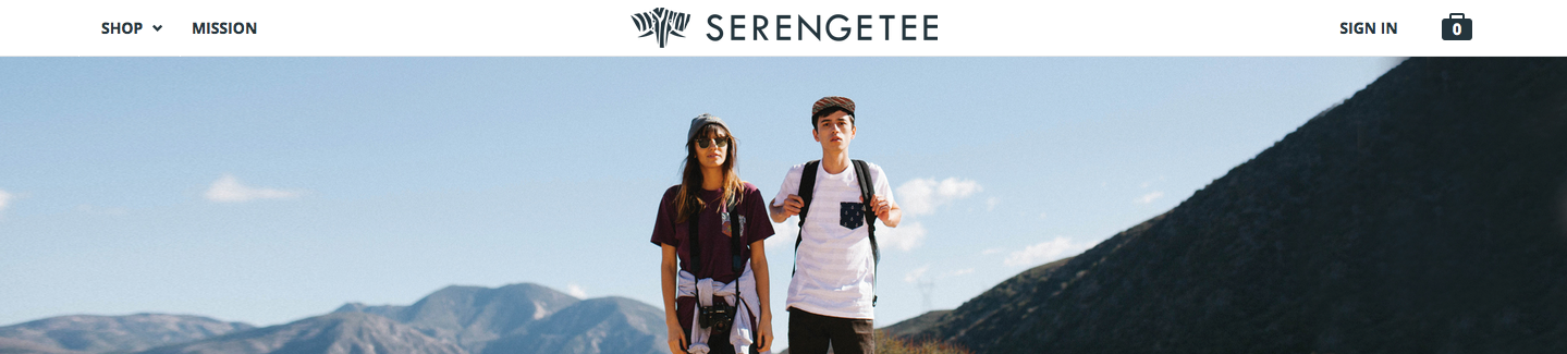
In some ways, Serengetee is a typical online retail site, but a unique brand and purpose set it apart.
Serengetee’s product listings are organized not by clothing type, but by fabric design: the company incorporates patterns from countries around the world and customizes them onto a variety of clothing types. With each purchase, part of the revenue goes to a charity based in that unique fabric’s country of origin.

This combination of a novel, charitable mission and fashion-forward products has attracted many millennial customers, and the brand feels specially crafted for this demographic, with adventurous photos, a special focus on the causes they support, and high social engagement.
To evaluate Serengetee’s usability, we invited 30 millennials who had not purchased from Serengetee before to try to make a purchase online. Besides the typical survey questions at the end of the test (“What was the worst thing about your experience? What aspects could be improved?”), we had testers complete the UX Crowd survey to see which key issues would come out in the voting.
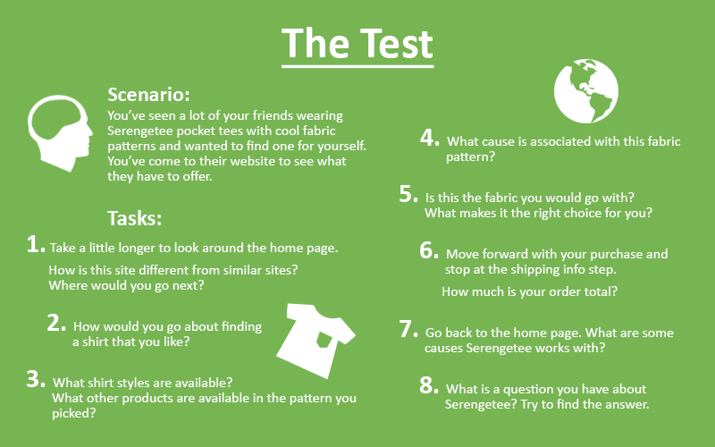
The UX Crowd attempts to harness the ‘wisdom of crowds’ by drawing submissions on what testers liked about the website, what they didn’t like about it, and what they would improve about it. The first 5 testers submit their responses, and the remaining testers assign weighted votes to indicate which ones they most agree with, as well as comment on the submissions.
Theoretically, this should allow the best and most relevant ideas to bubble up to the top and show which issues were most important to the users, delivering the crowd’s collective wisdom to the researcher while liberating him of the burden of watching the actual videos.
What does the crowd say?
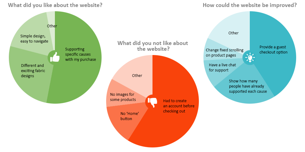
By far the most important takeaway from the UX Crowd results was users’ dissatisfaction with the lack of a guest checkout option. Other more minor issues included the lack of a clearly labelled ‘Home’ button, missing images for previewing certain products, and a scattering of other small problems.
Some of the suggestions for improvement also implied problems with the site — improve the fixed scrolling that occurs on product pages, for example. Other suggestions showed what users valued and wanted more emphasis on: the 2nd-most popular idea was to show how many people had supported each different charity.
The charity partnerships were, in fact, what users liked most about the site, as the UX Crowd results showed. It is also clear that Serengetee successfully wows visitors with the beautiful fabric designs they offer and their very simple navigation and visual style.

Learn more: User testing to achieve better digital products
What’s missing?
To test the validity of the crowd’s analysis, we took a look at the videos and the individual written responses of the 30 testers to see if anything was missing from UX Crowd.
Among the written responses to the question “What was the worst thing about your experience?”, consistent with the findings from UX Crowd, 30% of testers indicated that the lack of a guest checkout option was the worst part of their shopping experience.
However, an even higher proportion of testers, 34%, named another issue: a broken link called “Shop by Cause” where customers hoped to sort products by cause or simply see all of the charities at once.
As Patricia from Philadelphia put it:
I clicked on Shop by Cause and assumed that’s where I could find more information on different causes that Serengetee works with. But it looks like this page didn’t load.
This issue continues to be one of the most frequently mentioned in response to the question “What other aspects of the site could be improved?”; other answers to this question included the desire for a guest checkout, and the “need for a search bar.”
Diving deeper into the test videos, we found more issues, especially associated with the checkout process. These included lack of clear guidance during registration, overlapping text in notification blurbs, and a number of other factors that complexify the process of creating a new account. These glitches might be one reason for the popular demand for a guest checkout option.
With respect to what customers liked about the website, the answers from the crowd align almost perfectly with our observations from the videos and the written survey responses. The most common answers from all of these were, in the words of testers, “causes and stories associated with each product,” “cool pattern designs,” and a “user-friendly interface.”
Overall, our comparison suggests that UX Crowd hits at some core issues and clearly pinpoints the most common problem run into by customers — lack of guest checkout. Additionally, UX Crowd also correctly identifies the main selling points of the website.
However, one prominent issue surfaced throughout the videos and written responses that was not mentioned at all in UX Crowd — the broken link to the Shop by Cause page.
Why did the crowd leave that out?
Potential explanations
The difference may simply be a question of wording. The UX Crowd survey asks respondents “What did you not like about the website?” whereas the written survey asked, “What was the worst thing about your experience?” It’s possible this seemingly minor difference could have influenced testers to omit some issues by switching the focus from “your experience” to “the website” in general.
Another potential explanation is rooted in the test design itself. One of our tasks had users look into the causes Serengetee works with after finishing the checkout process; originally designed to create a comprehensive examination of the site, it seems this task may have drawn an unrepresentative level of attention to the issue of the broken link.
Read more:
It’s questionable whether this task is really a step users would normally take. And another related factor may also be at play here: compared to the checkout issues which did surface in UX Crowd, viewing the supported causes is much less central to the user’s goals on the site. While going through checkout is absolutely necessary to complete a purchase, looking at causes is not.
In that case, UX Crowd successfully identifies the more crucial issues of the user experience and winnows out the peripheral ones.
However, it’s also possible that by collecting only submissions from the first 5 testers, and having the rest just vote, the breadth of issues supplied is not sufficient. One might imagine the likelihood of a very important issue being left out by 5 separate people would be low, but it’s certainly not impossible.

Can usability analysis be left to the crowd?
When we return to this question, it seems that the answer is both yes and no. The UX Crowd results did accurately point to the most central usability issue with the website and provide a quick understanding of the core problem spots without a look at the actual videos.
So for the researcher under time constraints, UX Crowd is a great way to narrow down all the issues to just a few critical ones to work on for the next build. Given the vast number of problems every usability study is certain to uncover, this speedy prioritization is the most valuable contribution that UX Crowd makes (though sooner or later, every issue should be addressed).
However, UX Crowd results are far from comprehensive, and it is impossible to understand the issues in their full complexity without delving into the raw data too. Few usability problems can be summed up in just a sentence, and to formulate a plan for fixing them the team needs to watch real user moments and see the root of the issue.
UX Crowd can enable this process by identifying which spots to look at, saving time and helping to organize a deeper research strategy. But it is only through a combination of crowdsourced usability data and insights straight from the test videos that a successful and efficient design roadmap can emerge.
Oh, and one more thing — if you didn’t watch the videos, you’d never know that half of the testers pronounced the company’s name wrong. It’s SAIR-uhn-GEH-tee!
Get started user testing your own website for free today: