(Image source: The Royal Budha)
In engineering, the signal-to-noise ratio refers to the relative strength of an electrical signal compared to the strength of the background noise. Too much noise, and the signal can become difficult or impossible to decipher.
Signal-to-noise ratio is an important consideration in design, too.
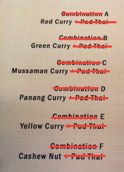
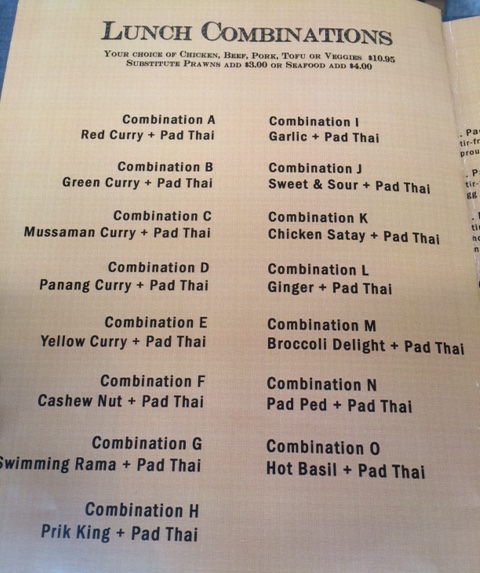
Here’s a simple example. This lunch menu shows 15 combination choices available for the same price. The “signal” is the information differentiating each of the combinations – specifically, the unique dish offered alongside the Pad Thai. If the whole list was boiled down to just the signal, it would look something like:
Each combination includes a Pad Thai and an additional dish, as listed
A – Red Curry
B – Green Curry
C – Mussaman Curry
…
What happens in the menu design above, though, is that noise crowds the list and makes it almost visually jarring. First of all, the word “Combination” is repeated 15 times, above every combination choice. This clutters the page and distracts from the useful information, all while adding nothing. It is a list of lunch combinations; labeling every entry “Combination” is entirely unnecessary.

Additionally, all of the text is bold, undoing any of the usefulness that bolded text offers: if everything is important, nothing is. No piece of content is given priority, and instead the entire list is just made visually louder. The signal is left to jostle for the user’s eye among a cacophony of extraneous content.
The list is still readable, but not quickly or easily comprehensible. The reader must work harder and take longer to get to the “signal” that they really want. And each time they look away, looking back requires a moment of re-orientation and re-learning the list.
Signal-to-Noise Ratio in web design
If a simple lunch menu can suffer from poor SNR, imagine how much easier it is to drown the signal on a complex, interactive webpage. The temptation to add more noise is ever-present for the designer, and it’s a hard line to walk between aesthetic choices that support the design, and ones that distract from it.
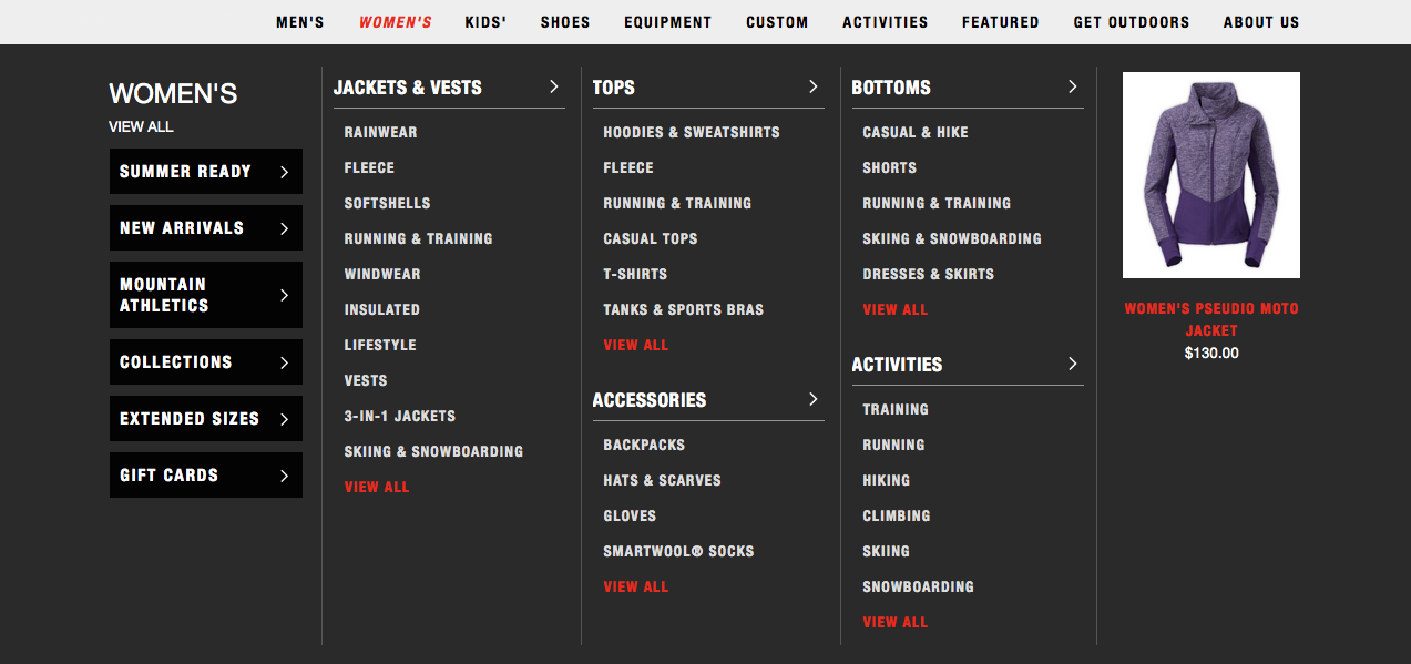
Here’s another example of a disorienting list of options to pick from, taken from an apparel website. While the visual effect is similar to the Thai menu, this dropdown menu is different in that there actually aren’t a lot of wasted words. Most every item contributes to the signal (though there does seem to be a lot of redundancy).
One “noisy” design choice does stand out, however: the use of all capital letters for everything. Text in all capitals is known to be less readable than lower-case text, because it eliminates the physical contours that help our brains recognize and process words. Clearly this was a stylistic decision, but on a list as encyclopedic as this one, it makes comprehension even slower. Skimming for the right category would be much easier with lower-case entries.
This is an aesthetic choice that ends up distracting from the signal, creating counterproductive noise that works against the website’s goals and decreases usability.
Design that undermines
Design decisions almost always affect usability, because they tend to either support or distract from the core purpose of the site or feature. When they don’t contribute to the communication of the “signal,” they can become noise-generating distractions, and actually drown out the information necessary for using a platform to its fullest.
So each time you make a design decision, especially for aesthetics, stop and ask yourself:
“Am I drowning my message, or supporting it?”
Learn more: user testing better products and user testing new products


