You don’t have to be an expert to run a great user testing study. In fact, you may have to set aside a lot of your preconceptions and forget what you think you know to achieve the best results from your research.
Here are some of the most common user testing questions we get from new usability researchers.
What can I learn from user testing?
Remote user testing allows you to see your website through the eyes of your user. As owners, designers, or developers of a product, we quickly get to the point where we can’t actually see or experience our website as a first-time user does. We become so familiar with what we have created that we just can’t see aspects of the flow or copy that might be confusing or misunderstood.
On running their first website user test, customers invariably have several “aha” moments when a user stumbles upon a glaringly confusing aspect of their site that they were previously blind to.

Madeline Frechette | UX Designer, IdeaScale
“The honest, raw feedback we got through Trymata helped us set aside our biases and prioritize our roadmap based on what our customers really wanted.”
How is unmoderated remote user testing different from moderated testing?
Moderating a user test is very hard to do, especially if you are close to the product being tested. The key to professionally moderating a test is to let go. You must be able to let the user stumble around and find his way without jumping in to save them. This is often very difficult to do for owners, developers, UX researchers, or designers of a product.
There is also a strong tendency for the user to want to please the moderator and do and say the right thing, which decreases the accuracy of the test results. Removing the moderator from the picture makes it easier for the user to be brutally honest because that human connection is no longer interfering.
Remote unmoderated user testing avoids these problems entirely. You simply have to write a good test. You don’t have to worry about leading the witness and spoiling the test when you are face to face with the user.
You can also easily modify a test and try it on additional users. This way you can evolve your test script systematically and get objective results.

How many users do I need for my usability study?
In general, usability testing follows the law of diminishing marginal returns: each additional test result provides less new insights than the one before it.
So, the very first video result that you watch may uncover around 30% of all the major usability issues, but the second result will repeat some of the same issues and the remainder might comprise only another 20% of the major usability issues.
Jakob Nielsen, the author of “Usability Engineering,” has found that it only takes 5 users to uncover 80% of usability problems, which should be enough to get you started with your next iteration. After 15 users, virtually all of your website’s issues should be uncovered.
However, if your study aims to also collect reliable quantitative usability data, you’ll likely want to run more than 15 tests. We’ve found that 30 is a good number of test results to get meaningful data while staying manageable – with careful targeting, it’s still possible to locate and pick through the most crucial video moments.
Plus, with larger studies, especially with 30 users or more, you can use the UXCrowd to do the bulk of the usability analysis with high accuracy, even without watching most of your videos.
Read more: The right number of users for a usability test
Sign up for a free trial and collect your first 5 user test results at no charge!
How can I get the most relevant feedback for my website?
Demographics:
The first piece of the puzzle is finding the right testers. The ideal tester for getting relevant and accurate usability feedback is representative of your product’s target demographic, and naturally inclined to perform the tasks that you want them to test.
For example, if your website or app sells high-end winter weather wear, you’ll get more representative feedback by testing with users in upper income brackets living in cold climates like the Northeast, Midwest, and Canada. That’s not to say that someone from Miami wouldn’t have anything useful to say about your site, but they would probably know a lot less about what to look for in a good jacket.
Read more: Writing tasks for an e-commerce usability test
Scenario:
To get the best feedback from your users, they should be immersed as much as possible in the mindset of someone using your product in a real-life context. To achieve this, the scenario you design for your test should be detailed and realistic. Write a scenario that sounds like a story, not a set of instructions.
This allows the user to dive into the experience and explore your product with the perspective of a real-life user. If you’ve done your demographic selection well, a detailed scenario like this one may be pretty identifiable or at least imaginable for your testers.
Tasks:
Remember that the tasks you include in your test should mimic a real-life user journey as much as possible. Think about how someone visiting the site might progress through different pages towards a goal. You probably have a pretty good idea of how visitors move through your site based on analytics; use that knowledge to lay out a smooth and natural journey that a real user might actually take.
Word choice matters too. When writing tasks, avoid key words used within your application – tell users the end goal to be achieved, not the action to take. Not only will this show you how easily the user identifies and locates the way to complete the task, it might reveal a totally different way they may think about achieving that goal.

How can I prioritize the issues uncovered in my tests?
The obvious answer is to observe: as you watch your test results, make note not only of the issues people run into, but also of things like how many users encounter it, how it affects their performance on other tasks, and their reaction to it.
Problems are higher priority if:
- A higher proportion of users encounter the same issue
- The issue totally blocks users from completing a task instead of just making it harder
- The issue has a domino effect on other tasks during the user test
- Users have a particularly strong negative reaction to the issue
Written survey:
Looking for patterns among the written survey responses is a great way to complement insights from your video data. For one thing, it’s a good way to see which parts of the experience stuck the most in users’ minds; since they won’t be able to mention all of the problems they ran into, the ones they choose to address in their written survey will be telling.
The other useful information will be which issues are brought up most frequently. If everyone remembers the same bad thing about your website, that thing partially defines your UX in your users’ eyes.

Quantitative metrics:
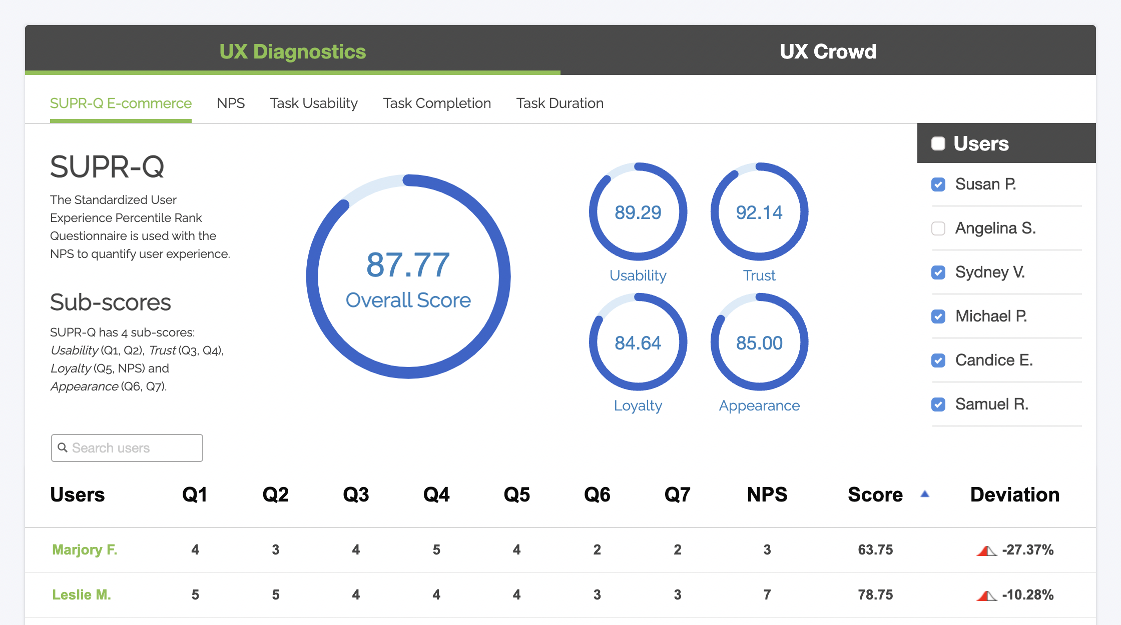
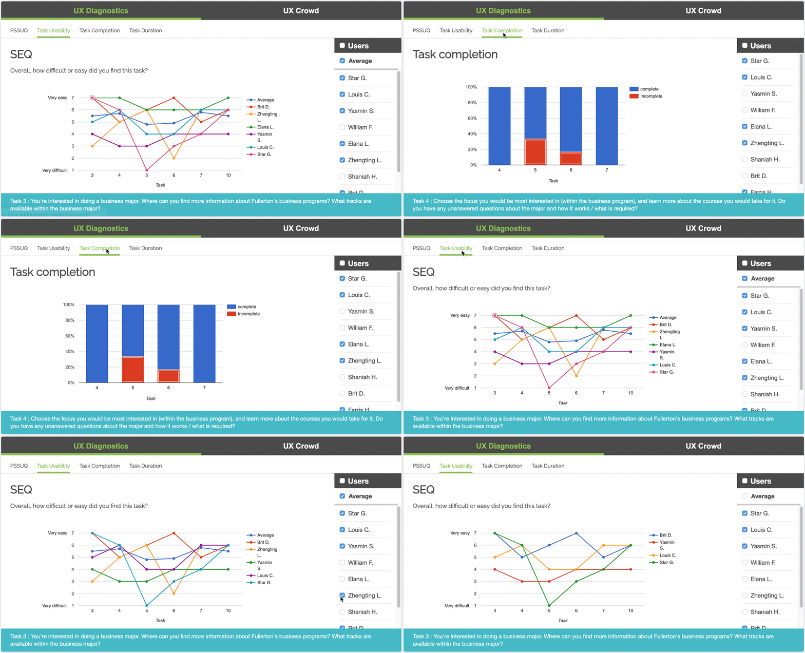
The Single Ease Question (SEQ) is a metric for measuring the usability of tasks in a user test. After each task, the user rates its difficulty on a scale of 1 to 7; the end product is a journal of difficulty-over-time for each individual’s experience. Looking at peaks and troughs in users’ SEQ scores is a good indicator for which parts of your UX should be focused on first.

Crowdsource it:
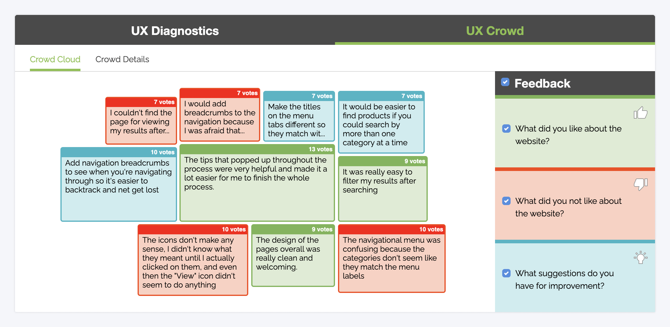
The UX Crowd is a way to let the wisdom of the crowd help you plan your product priority list. In high-volume usability studies, testers can submit the best and worst things about the website, then vote on each others’ submissions to generate a ranked list of things you need to improve. The UX Crowd removes the UX researcher’s biases from the equation and puts users at the very center of your UX roadmap.
Start finding and eliminating your website’s UX issues with a free trial:
Why user testing?
It works! User testing is cost-effective to perform and, when you do it early and often, it can save you months of development effort and thousands of dollars in expenses.
Your developers and designers, while immensely talented, aren’t like the people you’re trying to reach with your website. They think differently and speak an entirely different vocabulary, and most likely aren’t familiar with UX research practices. Designing products that make sense to your team generally produces a site that is not understandable or usable by your audience. With user testing and research, you can peek into your users’ heads and design a product that makes sense for them.


